


Summary
Color psychology is the study of hues as a determinant of human behavior. Color influences perceptions that are not obvious, such as the taste of food. Colors have qualities that can cause certain emotions in people.[1] How color influences individuals may differ depending on age, gender, and culture.[2] Although color associations can vary contextually between cultures, color preference is thought to be relatively uniform across gender and race.[3]
Color psychology is also widely used in marketing and branding. Marketers see color as an important factor, since color can influence a consumers' emotions and perceptions about goods and services.[4] Logos for companies are important, since the logos can attract more customers.[5]
The field of color psychology applies to many other domains such as medical therapy, sports, hospital settings, and even in game design. Carl Jung has been credited as one of the pioneers in this field for his research on the properties and meanings of color in our lives. According to Jung, "colours are the mother tongue of the subconscious."[4]
Before there was color psychology as a field, color was being used for centuries as a method of treatment as early as 2000 BC. The ancient Egyptians documented color "cures" using painted rooms or sunlight shining through crystals as therapy. One of the earliest medical documents, the Huangdi Neolignane Ching, documents color diagnoses associated with color healing practices.[6]
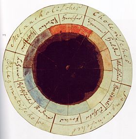
In 1810, German poet Johann Wolfgang von Goethe published Theory of Colors, a book explaining his beliefs on the psychological nature of color.[7] In his book, von Goethe describes the color yellow as "serene" and blue as a mixture of "excitement and repose."[8] In 1942, Kurt Goldstein, a German neurologist, conducted a series of experiments on various participants to determine the effects of color on motor function. In one experiment, Goldstein claims that a woman suffering from a cerebral disease was prone to frequently falling over and wearing red significantly increased this. However, wearing the colors green or blue calmed these symptoms.[9] Other researchers were unable to prove Goldstein's studies to be true, therefore, his hypothesis is considered inaccurate.[10] While Goldstein's hypothesis was never proven, his work encouraged further research into the physiological effects of color.[10]
Carl Jung is most prominently associated with the pioneering stages of color psychology in the 20th century. Jung was most interested in colors' properties and meanings, as well as in art's potential as a tool for psychotherapy. His studies in and writings on color symbolism cover a broad range of topics, from mandalas to the works of Picasso to the near-universal sovereignty of the color gold, the lattermost of which, according to Charles A. Riley II, "expresses... the apex of spirituality, and intuition".[11] In pursuing his studies of color usage and effects across cultures and time periods, as well as in examining his patients' self-created mandalas, Jung attempted to unlock and develop a language, or code, the ciphers of which would be colors. He looked to alchemy to further his understanding of the secret language of color, finding the key to his research in alchemical transmutation. His work has historically informed the modern field of color psychology.
General model edit
The general model of color psychology relies on six basic principles:
- Color can carry a specific meaning.
- Color meaning is either based in learned meaning or biologically innate meaning.
- The perception of a color causes evaluation automatically by the person perceiving.
- The evaluation process forces color-motivated behavior.
- Color usually exerts its influence automatically.
- Color meaning and effect has to do with context as well.[12]
Embodied and referential theory of color edit
According to the embodied and referential theory of color,[13][14][15] color can convey two types of meaning that uniquely stimulate and shape consumer preferences and behaviors.
- Referential meaning arises from the network of semantic associations that emerge through exposure to color stimuli. As such, referential meaning is learned and often dependent on contextual cues. For example, the referential meaning conveyed by the use of the color brown in effervescent beverages can evoke notions of cola taste, which are drawn from the learned association of prominent cola brands adding caramel color to their products.
- Embodied meaning results from attributes embodied in the aesthetic stimulus, independent of context and the semantic content it may evoke. This meaning is evoked from properties within the stimulus itself; that is feelings and other responses are activated simply from exposure to the color. For example, long wavelength colors like red may stimulate arousal and increase attention. This model proposes that biological responses to color (e.g., physiological responses such as increased heart rate or attention) are driven by color's embodied meaning
- The model also considers that influencers of color experience do not act in isolation. For instance, some learned color associations may represent a cognitive reinforcing or alteration of biologically based phenomena. Moreover, color associations may vary by culture and learned color associations may also influence some cultural aspects.
- The theory notes the importance of context for referential meanings of color (i.e., these meanings are context-dependent, while the embodied meanings are not).
Influence of color on perception edit
Multiple researchers propose that one factor in the evolution of primate trichromatic color vision is to allow for better perception of others' emotions or condition which can prove highly useful for complex social interaction.[16] For example, flushed or pale skin can non-verbally communicate whether they are excited or sickly. Besides its use for social situations, color has an impact in multiple facets of our perceptions.
Taste edit
Color also affects how people perceive the edibility and flavor of foods and drinks.[17] This extends beyond just the color of the food itself. The packaging of the food and its placement among other foods and objects also affect how people perceive it. For example, in food stores, bread is normally sold in packaging decorated or tinted with golden or brown tones to promote the idea of home-baked and oven-freshness.[18] People can mistake a cherry-flavored drink for being lime or lemon flavored if that drink was a green color. Additionally, a flavor can be intensified by a color. People can rate a brown M&M as more chocolate flavored than a green M&M based on color.[17] This interaction can be mediated by our perceptions as well, especially depending on cultural expectation. Research in the UK demonstrated that individuals receiving a brown drink would have different expectations for the taste (i.e. expecting a Cola) while someone from Taiwan may expect a grape-flavored drink because popular brown colored drinks in their culture are typically grape-flavored.[19]
Time edit
Recent studies[20] showed that the perceived duration of a red screen was longer than that of a blue screen. The results reflected sex differences; men overestimated the duration of the red screen. Additionally, the reaction times to a red screen were faster than those to a blue screen. Participants who reacted quickly to a red screen overestimated its duration. In a demo with 150 people chosen at random, it was found that inside a pod bathed in blue color the average perceived duration of a minute was 11 seconds shorter than in a pod bathed in red color.[21] However, another study looking at perceived duration found opposite results regarding blue and red stimuli.[22]
Light edit
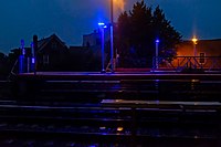
The color of a light source affects the apparent color of an object the light shines on. For example, the color of an object might appear different in the light from the sun versus from an incandescent (tungsten) light bulb. With the incandescent light bulb, the object might appear more orange or "brownish", and dark colors might look even darker.[23] Light and the color of an object can affect how one perceives its positioning. If light or shadow, or the color of the object, masks an object's true contour (outline of a figure) it can appear to be shaped differently from reality.[23] Objects under a uniform light-source will promote better impression of three-dimensional shape.[23] The color of an object may affect whether or not it seems to be in motion. In particular, the trajectories of objects under a light source whose intensity varies with space are more difficult to determine than identical objects under a uniform light source. This could possibly be interpreted as interference between motion and color perception, both of which are more difficult under variable lighting.[23] Blue light causes people to feel relaxed, which has led countries to add blue street lights in order to decrease suicide rates.[24] A railroad company in Japan installed blue lighting on its stations in October 2009 in an effort to reduce the number of rail suicide attempts,[25] although the effect of this technique has been questioned.[26] In 2000, the city of Glasgow installed blue street lighting in certain neighborhoods and subsequently reported the anecdotal finding of reduced crime in these areas.[27][28]
Lighting color could also have a strong effect on perceived experience in stores and other situation. For example, time seems to pass more slowly under red lights and time seems to pass quickly under blue light.[29] Casinos take full advantage of this phenomenon by using color to get people to spend more time and hence more money in their casino.[29] However, a presumed influence of colored light (red vs. blue) on risk behavior could not be demonstrated.[30]
Medicine edit
The color of placebo pills is reported to be a factor in their effectiveness, with "hot-colored" (red, yellow, etc.) pills working better as stimulants and "cool-colored" (blue, purple, etc.) pills working better as depressants. This relationship is believed to be a consequence of the patient's expectations and not a direct effect of the color itself.[31] Consequently, these effects appear to be culture-dependent.[32]
One study found that changing the original color of an antiepileptic pill increased the risk of in-adherence to the medication in patients diagnosed with a seizure disorder.[33]
Color preference and the connection between color and emotion edit
How people respond to different color stimuli varies from person to person. In a U.S. study, blue is the top choice at 35%, followed by green (16%), purple (10%) and red (9%).[34] Blue and green may be due to a preference for certain habitats that were beneficial in the ancestral environment as explained in evolutionary aesthetics.[35] Orange, yellow, and brown are the least popular colors, respectively.[36]
One theory for why people prefer one color over another is called ecological valence theory (EVT) proposed by Stephen Palmer and Karen Schloss.[37] This theory asserts that people tend to like or dislike colors based on their associations of the color to other objects or situations that they have strong feelings about. For example, if someone associates the color blue with clean water, they would be more likely to favor blue. On the other hand, people's dislike of the color brown could be due to associations of it with feces or rotten food.
Color preference may also depend on ambient temperature. People who are cold often select warm colors such as red or yellow, while people who are hot favor cool colors like blue and green.[12] Introverted individuals are also found to be more attracted to cool colors, while extroverts prefer warmer colors.[38]
Psychologist Andrew J. Elliot tested to see if the color of a person's clothing could make them appear more sexually appealing. He found heterosexual men and women dressed in red were significantly more likely to attract romantic attention than women dressed in any other color. The color did not affect heterosexual women's assessment of other women's attractiveness. Other studies have shown men dressed in red appeal to heterosexual women.[39]
A light's warmth or coolness can be described by its color temperature. The Kelvin scale is used to quantify the color temperature spectrum. These numbers are used to characterize the hue of artificial light. Since each person has their own unique method of perceiving color, there are a variety of color temperatures that will work well for certain tasks. Neutral and soft white is a friendly and clean light best for kitchens and bathrooms or any kind of workspace; cool light is adequate for offices, hospitals, and other commercial uses; and warm light creates a cozy, calm, inviting atmosphere that is ideal for bedrooms, living rooms, family rooms, dining rooms, and other spaces requiring an intimate, personal mood.[40]
Uses in marketing edit
Since color is an important factor in the visual appearance of products as well as in brand recognition, color psychology has become important to marketing. Recent work in marketing has shown that color can be used to communicate brand personality.[41]
Marketers must be aware of the application of color in different media (e.g. print vs. web), as well as the varying meanings and emotions that a particular audience can assign to color. Even though there are attempts to classify consumer responses to different colors, everyone perceives color differently. The physiological and emotional effect of color in each person is influenced by several factors such as past experiences, culture, religion, natural environment, gender, race, and nationality. When making color decisions, it is important to determine the target audience in order to convey the right message. Color decisions can influence both direct messages and secondary brand values and attributes in any communication. Color should be carefully selected to align with the key message and emotions being conveyed in a piece.[42]
Research on the effects of color on product preference and marketing show that product color could affect consumer preference and hence purchasing culture. This is mostly due to associative learning. Most results show that it is not a specific color that attracts all audiences, but that certain colors are deemed appropriate for certain products.[43]
Brand meaning edit
Color is a very influential source of information when people are making a purchasing decision.[29] Customers generally make an initial judgment on a product within 90 seconds of interaction with that product and about 62–90% of that judgment is based on color.[29] People often see the logo of a brand or company as a representation of that company. Without prior experience to a logo, we begin to associate a brand with certain characteristics based on the primary logo color.[44]
Color mapping provides a means of identifying potential logo colors for new brands and ensuring brand differentiation within a visually cluttered marketplace.[45][failed verification]
A study on logo color asked participants to rate how appropriate the logo color was for fictional companies based on the products each company produced. Participants were presented with fictional products in eight different colors and had to rate the appropriateness of the color for each product. This study showed a pattern of logo color appropriateness based on product function. If the product was considered functional, fulfills a need or solves a problem, then a functional color was seen as most appropriate. If the product was seen as sensory-social, conveys attitudes, status, or social approval, then sensory-social colors were seen as more appropriate.[44]
Company logos can portray meaning just through the use of color.[46] Color affects people's perceptions of a new or unknown company. Some companies such as Victoria's Secret and H&R Block used color to change their corporate image and create a new brand personality for a specific target audience.[46] Research done on the relationship between logo color and five personality traits had participants rate a computer-made logo in different colors on scales relating to the dimensions of brand personality. Relationships were found between color and sincerity, excitement, competence, sophistication, and ruggedness. A follow-up study tested the effects of perceived brand personality and purchasing intentions.[46] Participants were presented with a product and a summary of the preferred brand personality and had to rate the likelihood of purchasing a product based on packaging color. Purchasing intent was greater if the perceived personality matched the marketed product or service. In turn color affects perceived brand personality and brand personality affects purchasing intent.[46]
Although color can be useful in marketing, its value and extent of use depends on how it is used and the audience it is used on.[47] The use of color will have different effects on different people, therefore experimental findings cannot be taken as universally true.
Specific color meaning edit
Different colors are perceived to mean different things. For example, tones of red lead to feelings of arousal while blue tones are often associated with feelings of relaxation. Both of these emotions are pleasant, so therefore, the colors themselves can procure positive feelings in advertisements. The chart below gives perceived meanings of different colors in the United States.
Functional (F): fulfills a need or solves a problem[44]
Sensory-Social (S): conveys attitudes, status, or social approval[44]
| Red | Yellow | Green | Blue | Pink | Violet/Purple | Orange | Brown | Black | White |
|---|---|---|---|---|---|---|---|---|---|
| Lust (S)[48] | Competence (S)[46] | Good Taste (F)[48] | Sophistication (S)[46] | Authority (S)[48] | Warmth (S)[49] | Ruggedness (S)[46] | Grief (S)[48] | Happiness (S)[48] | Sincerity (S)[46] |
| Power (S)[50] | Happiness (S)[48] | Envy (S)[48] | Competence (S)[46] | Sophistication (S)[46] | Excitement (S)[49] | Sophistication (S)[46] | Purity (S)[48] | ||
| Excitement (S)[46] | Inexpensive (F)[36] | Eco-Friendly (F)[51] | High quality (F)[48] | Feminine and Flirty (S)[48] | Power (S)[48] | Expensive (F)[48] | |||
| Love (S)[48] | Low Quality (F)[36] | Health (S)[51] | Corporate (F)[48] | Fear (S)[48] | |||||
| Speed (S)[3] | Money (F)[52] | Reliability (F)[36] | |||||||
| Anger (S)[53] |
Meanings in cartography edit

In map design, additional color meanings are commonly employed to create intuitive map symbols, due to the natural colors of common geographic features.[54] These correlations are commonly stylized and conventionalized, so that the color with the most intuitive meaning is often the nearest prototypical named color rather than that most similar to the real-world color (e.g., in very rare locations, water depth is symbolized using different shades of the color blue). Common, but by no means authoritative or exhaustive, examples include:
- Green: vegetation
- Blue: water (water bodies, precipitation), cold
- Yellow: dryness
- Brown: soil
- Red: heat, wildfire
- Purple: unnatural (contrasting with natural connotations of green, yellow, blue)
- Gray/Black: human structures (roads, buildings)
Other colors can have intuitive meaning due to their role in Gestalt psychology and other cognitive aspects of the map-reading process. For example, shades that contrast most with the background (i.e., dark on a white page, light on a dark screen) are naturally perceived as "more" (higher values of quantitative properties, more important in the Visual hierarchy) than shades with less contrast.
Combining colors edit
Although some companies use a single color to represent their brand, many other companies use a combination of colors in their logo, and can be perceived in different ways than those colors independently. When asked to rate color pair preference of preselected pairs, people generally prefer color pairs with similar hues when the two colors are both in the foreground; however, greater contrast between the figure and the background is preferred.[55]
In contrast to a strong preference for similar color combinations, some people like to accent with a highly contrasting color.[56] In a study on color preference for Nike, Inc. sneakers, people generally combined colors near each other on the color wheel, such as blue and dark blue. However, a smaller segment preferred to have the Nike swoosh accentuated in a different, and contrasting, color. Most of the people also used a relatively small number of colors when designing their ideal athletic shoe. This finding has relevance for companies that produce multicolored merchandise, suggesting that to appeal to consumer preferences, companies should consider minimizing the number of colors visible and using similar hues in any one product.[57]
Color name edit
Although different colors can be perceived in different ways, the names of those colors matters as well.[57][58] These names are often called visual color descriptors. Many products and companies focus on producing a wide range of product colors to attract the largest population of consumers. For example, cosmetics brands produce a rainbow of colors for eye shadow and nail polish, to appeal to every type of person. Even companies such as Apple Inc. and Dell who make iPods and laptops do so with a certain amount of color personalization available to attract buyers. Moreover, color name, not only the actual color, can attract or repel buyers as well. When asked to rate color swatches and products with either generic color names (such as brown) or "fancy" color names (such as mocha), participants rated items with fancy names as significantly more likable than items with generic names.[57] In fact, the same paint color swatch with two different names produced different rating levels, and the same effect was found when participants rated the pleasantness of towels given fancy or generic color names,[57] showing an overall pattern of preference for fancy color names over generic ones when describing exactly the same color.
In addition to fancy names being preferred for their aural appeal, they may contribute to the product they represent being liked more, and, therefore impacting sales.[59] A yellow jelly bean with an atypical color name such as goldenrod is more likely to be selected than one with a more typical name such as lemon yellow. This could be due to greater interest in atypical names, as well as curiosity and willingness to "figure out" why that name was chosen. Purchasing intent patterns regarding custom sweatshirts from an online vendor also revealed a preference for atypical names. Participants were asked to imagine buying sweatshirts and were provided with a variety of color name options, some typical, some atypical. Color names that were atypical were selected more often than typical color names, again confirming a preference for atypical color names and for item descriptions using those names.[59] Moreover, those who chose sweatshirts bearing atypical color names were described as more content with their purchase than those who selected similar items bearing typical color names.
Attracting attention edit

Color is used as a means to attract consumer attention to a product that then influences buying behavior.[60] Consumers use color to identify for known brands or search for new alternatives. Variety seekers look for non-typical colors when selecting new brands. Attractive color packaging receives more consumer attention than unattractive color packaging, which can then influence buying behavior. A study that looked at visual color cues focused on predicted purchasing behavior for known and unknown brands.[60] Participants were shown the same product in four different colors and brands. The results showed that people picked packages based on colors that attracted their voluntary and involuntary attention. Associations made with that color such as 'green fits menthol', also affected their decision. Based on these findings implications can be made on the best color choices for packages. New companies or new products could consider using dissimilar colors to attract attention to the brand, but off-brand companies could consider using similar colors to the leading brand to emphasize product similarity. If a company is changing the look of a product, but keeping the product the same, they consider keeping the same color scheme since people use color to identify and search for brands.[60] This can be seen in Crayola crayons, where the logo has changed many times since 1934, but the basic package colors, gold and green, have been kept throughout.
Attention is captured subconsciously before people can consciously attend to something.[61] Research looking at electroencephalography (EEGs) while people made decisions on color preference found brain activation when a favorite color is present before the participants consciously focused on it. When looking at various colors on a screen people focus on their favorite color, or the color that stands out more, before they purposefully turn their attention to it. This implies that products can capture someone's attention based on color, before the person willingly looks at the product.[61]
In interactive design and behavioral design, color is used to develop visual hierarchies where colors are placed into saliency hierarchies that match other hierarchies. Examples include matching a color hierarchy to a navigational structure hierarchy, or matching a behavioral science hierarchy to the most salient colors in a visual hierarchy, to increase the odds that important behavior change principles are noticed by a target audience and processed by them.[62]
Store and display color edit

Color is not only used in products to attract attention, but also in window displays and stores.[63] When people are exposed to different colored walls and images of window displays and store interiors they tend to be drawn to some colors and not to others. Findings showed that people were physically drawn to warm colored displays; however, they rated cool colored displays as more favorable. This implies that warm colored store displays are more appropriate for spontaneous and unplanned purchases, whereas cool colored displays and store entrances may be a better fit for purchases where a lot of planning and customer deliberation occurs. This is especially relevant in shopping malls where patrons could easily walk into a store that attracts their attention without previous planning.[63]
Other research has provided evidence that store color, not just the product, influences buying behaviors.[58] When people are exposed to different store color scenarios and then surveyed on intended buying behavior, store color, among various other factors, are important for purchasing intentions. Blue, a cool color, was rated as more favorable and produced higher purchasing intentions than orange, a warm color. However, all negative effects to orange were neutralized when orange store color was paired with soft lighting. This shows that store color and lighting actually interact.[58] In this research, participants were not actually exposed to different colors of stores, but instead, color and lights were manipulated through the written description of the store.
Applications for therapy edit

Art therapy edit
Art therapy is a separate but related field of applied psychology. It comes from psychoanalytic theories in the 1970s that argued that some of our emotions and experiences cannot just be expressed in words, but in images and colors.[64] One intersection where color psychology could be of use to art therapists is in evaluating what certain colors mean to clients when they use them to create art pieces. Even the lack of color use can be an important detail in art therapy, as people struggling with depression tend to use less color when they are painting.[64] It's also suggested that by focusing on color use rather than the resulting image made by a client, you can avoid clients' anxiety over producing a "good" product and focus more on what the colors they used mean to them in order to start a dialogue about their feelings.[64]
Chromotherapy edit
Chromotherapy is a treatment method adapted from ancient color-based practices that uses wavelengths in the visual spectrum (colors we can see) to treat different conditions.[65] This therapy has been researched to treat multiple physiological and psychiatric conditions, such as seasonal affective disorder (SAD), age-related cognitive decline, depression, and hypertension among others.[66][67][68]
Many in the healthcare field believe that chromotherapy does not have a robust research backing and have described it as a pseudoscience.[69] Other sources claim that while certain colors have been shown as beneficial to wellbeing, the clear definition of what wavelengths are beneficial and exactly how these benefits occur is not clear enough to put them to use in a medical setting.[70]
Individual differences edit
Gender edit
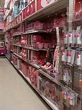
Children's toys are often categorized as either boys or girls toys solely based on color. In a study on color effects on perception, adult participants were shown blurred images of children's toys where the only decipherable feature visible was the toy's color.[71] In general participants categorized the toys into girl and boy toys based on the visible color of the image. This can be seen in companies interested in marketing masculine toys, such as building sets, to boys. For example, Lego uses pink to specifically advertise some sets to girls rather than boys. The classification of 'girl' and 'boy' toys on the Disney Store website also uses color associations for each gender.[72] An analysis of the colors used showed that bold colored toys, such as red and black, were generally classified as 'boy only' toys and pastel colored toys, such as pink and purple, were classified as 'girl only' toys. Toys that were classified as both boy and girl toys took on 'boy only' toy colors. This again emphasizes the distinction in color use for children's toys.[72]
Gender differences in color associations can also be seen amongst adults.[73] Differences were noted for male and female participants, where the two genders did not agree on which color pairs they enjoyed the most when presented with a variety of colors.[71][74] Men and women also did not agree on which colors should be classified as masculine and feminine. This could imply that men and women generally prefer different colors when purchasing items. Men and women also misperceive what colors the opposite gender views as fitting for them.
Gender has also shown to influence how colors are received, with some research suggesting women and men respectively prefer "warm" and "cool" colors.[12] Black, white, and gray, as tones or shades, were shown to be received more positively by males than females.[29]
Age edit
Children's toys for younger age groups are often marketed based on color, but as the age group increases, color becomes less gender-stereotyped.[71] In general many toys become gender neutral and hence adopt gender-neutral colors. In the United States it is common to associate baby girls with pink and baby boys with blue. This difference in young children is a learned difference rather than an inborn one.[75] Research has looked at the preference of young children, ages 7 months to 5 years, for small objects in different colors. The results showed that by the age of 2–2.5 years socially constructed gendered colors affects children's color preference, where girls prefer pink and boys avoid pink, but show no preference for other colors.[75]
Contrary to the adult fondness for blue, in children yellow is the most favored color, perhaps owing to its associations with happiness.[48] However, children like colors they find to be pleasant and comforting and their preferences don't change much, while adult color preference is usually easily influenced.[12] Slightly older children who have developed a sense of favorite color often tend to pick items that are in that color.[76]
Ecological valence theory has been cited as a possible reason for differences in color preferences between adults and infants.[77] Because adults have more associations between colors and objects or places from life experiences, their preferences change as they get older.
Culture edit
Many cultural differences exist on perceived color personality, meaning, and preference. When deciding on brand and product logos, companies should take into account their target consumer, since cultural differences exist. A study looked at color preference in British and Chinese participants.[73] Each participant was presented with a total of 20 color swatches one at a time and had to rate the color on 10 different emotions. Results showed that British participants and Chinese participants differed on the like-dislike scale the most. Chinese participants tended to like colors that they self rated as clean, fresh, and modern, whereas British participants showed no such pattern. When evaluating purchasing intent, color preference affects buying behavior, where liked colors are more likely to be bought than disliked colors.[60] This implies that companies should consider choosing their target consumer first and then make product colors based on the target's color preferences.
Wollard, (2000)[78] seems to think that color can affect one's mood, but the effect also can depend on one's culture and what one's personal reflection may be. For example, someone from Japan may not associate red with anger, as people from the U.S. tend to do. Also, a person who likes the color brown may associate brown with happiness. However, Wollard does think that colors can make everyone feel the same, or close to the same, mood.
Studies have shown people from the same region, regardless of ethnicity, will have the same color preferences. Common associations connecting colors to a particular emotion may also differ cross-culturally.[12] For instance, one study examined color relationships with emotion with participants in Germany, Mexico, Poland, Russia, and the United States; finding that red was associated with anger and viewed as strong and active.[79] However, only Poles related purple with both anger and jealousy while Germans linked jealousy with yellow. This highlights how the influence of different cultures can potentially change perceptions of color and its relationship to emotion.[23]
Sports performance edit

The color red has been found to influence sports performance. During the 2004 Summer Olympics the competitors in boxing, taekwondo, freestyle wrestling, and Greco-Roman wrestling were randomly given blue or red uniforms. A later study found that those wearing red won 55% of all their matches which was a statistically significant increase over the expected 50%.[80] The colors affected bouts where the competitors were closely matched in ability, where those wearing red won 60% of the matches, but not matches between more unevenly matched competitors. In post-war England, football teams wearing red uniforms have averaged higher league positions and have had proportionally more championship winners than teams using other colors.[81] In cities with more than one team, the teams wearing red outperformed the teams wearing other colors.
A study of the UEFA Euro 2004 found similar results. Another study found that those taking penalty kicks performed worst when the goalkeeper had a red uniform. More anecdotal is the historical dominance of the domestic honors by red-wearing teams such AFC Ajax, FC Bayern Munich, Liverpool F.C., and Manchester United F.C. Videos of taekwondo matches were manipulated in one study so that the red and blue colors of the protective gears were reversed. Both the original and the manipulated videos were shown to referees. The competitors wearing red were given higher scores despite the videos otherwise being identical.
Not only can color influence the players themselves in sports, but it can also influence other people's perceptions of the players. For example, one study demonstrates the effects of wearing various colored boxer trunks on the referees perception of the boxers. The results of the study indicated that competitors who wore red and black-colored trunks appeared stronger, more aggressive, and more dominant to the referee observing the match.[82]
Use in hospitals edit
At the turn of the 20th century, white was widely used in hospitals. In 1914, a surgeon in a San Francisco hospital, Harry Sherman, adopted green, "the complementary colour to hemoglobin" to avoid dazzle. This was adopted by a number of other American hospitals in the following decades. In 1916 Howard Kemp Prossor, a British art connoisseur, advanced a "colour cure" for shell shock. At around the same time, architect William Ludlow began to advocate pale pastel blues and greens in hospitals for therapeutic purposes and advising that "white is negative". In 1930, Dr. Charles Ireland of Guy's Hospital in London wrote Colour and Cancer, a book advocating the use of concentrated doses of colored light for treating cancer. The practice of using color in hospitals became widespread in the 1930s, particularly promoted by Faber Birren, who established himself as an "industrial color consultant" in 1934 and advised that an environment of soft colors, especially green, would be soothing for patients.[83]
Red is perceived as a strong and active color which may influence both the person wearing it and others perceiving it. An evolutionary psychology explanation is that red may signal health as opposed to anemic paleness, or indicate anger due to flushing instead of paleness due to fear. It has been argued that detecting flushing may have influenced the development of primate trichromate vision. Primate studies have found that some species evaluate rivals and possible mates depending on red color characteristics. Facial redness is associated with testosterone levels in humans, and male skin tends to be redder than female skin.[79]
Gaming edit
Since color is such an important element in how people interpret their environment, color psychology can enhance the feeling of immersion in people that play video games. By using color psychology to cause immersion in players, players can have fewer errors playing video games in comparison to a game that does not utilize color psychology immersion.[1]
Color psychology can even affect someone through the avatars they choose to use. A recent study from 2016[84] assessed the impact of avatar color on the gaming experience for educational games. The research compared two different color avatars; blue and red. They then measured the players using the avatars in terms of competence, immersion and flow. The study found that the players with the red avatar performed poorly compared to those with blue avatars. Another study on experienced players of first-person shooter games found that those assigned to wear red uniforms instead of blue won 55% of the matches.[79]
Research also indicates that color in video games can elicit various emotions in the player. Feelings of joy and sadness were strongly associated with the brightness, value, saturation, chroma and lightness of the game being played. The greater the color saturation was in the video game, the more strongly felt these emotions were among the players. Less color saturation in the video game predicted higher feelings of fear.[85]
See also edit
References edit
- ^ a b Roohi S, Forouzandeh A (May 2019). "Regarding color psychology principles in adventure games to enhance the sense of immersion". Entertainment Computing. 30: 100298. doi:10.1016/j.entcom.2019.100298. ISSN 1875-9521. S2CID 133023544.
- ^ Kurt, Sevinc; Osueke, Kelechi Kingsley (2014-01-01). "The Effects of Color on the Moods of College Students". SAGE Open. 4 (1): 215824401452542. doi:10.1177/2158244014525423. ISSN 2158-2440.
- ^ a b Birren F (1961). Colour Psychology & Colour Therapy. Secaucus, NJ: The Citadel Press. p. 198. ISBN 0806506539.
- ^ a b "Character Costume Design Creation", Character Costume Figure Drawing, Routledge, pp. 169–183, 2013-03-20, doi:10.4324/9780080954073-12, ISBN 978-0-08-095407-3, retrieved 2022-05-04
- ^ Findlay P (2018-09-12). "The ketchup and mustard theory of advertising, AKA learning to taste your brand". Mumbrella. Retrieved 2021-09-08.
- ^ "Color History". Colour Therapy Healing. 2016-04-01. Retrieved 2021-11-20.
- ^ Popova, Maria (2012-08-17). "Goethe on the Psychology of Color and Emotion". The Marginalia. Retrieved 2023-02-12.
- ^ von Goethe, Johann Wolfgang (2014-10-02). Goethe's Theory of Colors. Cambridge University Press. doi:10.1017/cbo9781107589438. ISBN 978-1-108-07544-2.
- ^ Goldstein, Kurt (June 1942). "Some Experimental Observations Concerning the Influence of Colors on the Function of the Organism". American Journal of Physical Medicine & Rehabilitation. 1 (1): 147–151. doi:10.1097/00002060-194206000-00002. ISSN 0894-9115. S2CID 84919425.
- ^ a b "Color Psychology". Nikolaev. Retrieved 2023-02-12.
- ^ Riley, Charles A. II. Color Codes: Modern Theories of Color in Philosophy, Painting and Architecture, Literature, Music, and Psychology. Hanover: University Press of New England, 1995, p. 307.
- ^ a b c d e Whitfield TW, Wiltshire TJ (November 1990). "Color psychology: a critical review". Genetic, Social, and General Psychology Monographs. 116 (4): 385–411. PMID 2289687.
- ^ Labrecque, Lauren Isabelle (2010). "The marketer's prismatic palette: Essays on the importance of color in marketing with implications for brand personality". Doctoral Dissertations Available from Proquest .AAI3409617.: 1–147.
- ^ Labrecque, Lauren I.; Patrick, Vanessa M.; Milne, George R. (February 2013). "The Marketers' Prismatic Palette: A Review of Color Research and Future Directions". Psychology & Marketing. 30 (2): 187–202. doi:10.1002/mar.20597.
- ^ Labrecque, Lauren I. (July 2020). "Color research in marketing: Theoretical and technical considerations for conducting rigorous and impactful color research". Psychology & Marketing. 37 (7): 855–863. doi:10.1002/mar.21359. ISSN 0742-6046. S2CID 219908855.
- ^ Elliot AJ, Maier MA (2014-01-03). "Color psychology: effects of perceiving color on psychological functioning in humans". Annual Review of Psychology. 65 (1): 95–120. doi:10.1146/annurev-psych-010213-115035. PMID 23808916. S2CID 22090017.
- ^ a b Shankar MU, Levitan C, Prescott J, Spence C (2009-04-28). "The Influence of Color and Label Information on Flavor Perception". Chemosensory Perception. 2 (2): 53–58. doi:10.1007/s12078-009-9046-4. ISSN 1936-5802. S2CID 59026706.
- ^ Bleicher S (2012). Contemporary Colour: Theory & Use. New York: Delmar. pp. 48, 50. ISBN 978-1-1335-7997-7.
- ^ Shankar MU, Levitan CA, Spence C (March 2010). "Grape expectations: the role of cognitive influences in color-flavor interactions". Consciousness and Cognition. 19 (1): 380–390. doi:10.1016/j.concog.2009.08.008. PMID 19828330. S2CID 32230245.
- ^ Masahiro Shibasaki, Nobuo Masataka (2014) "The color red distorts time perception for men, but not for women" Scientific Reports 4, Article number: 5899 doi:10.1038/srep05899
- ^ Beau Lotto in "Do You See What I See" (2011)
- ^ Makwana M (2018-02-26). "The effects of color on time perception – Blue stimuli are temporally overestimated". Timing Research Forum. Retrieved 2021-10-02.
- ^ a b c d e Shevell SK, Kingdom FA (2008). "Color in complex scenes". Annual Review of Psychology. 59: 143–166. doi:10.1146/annurev.psych.59.103006.093619. PMID 18154500. S2CID 24460261.
- ^ Baraniuk C. "Can blue lights prevent suicide at train stations?". www.bbc.com. Retrieved 2020-03-11.
- ^ "Can Blue-Colored Light Prevent Suicide?". Archived from the original on 2017-12-15. Retrieved 2010-02-18.
- ^ Will Blue Lights Reduce Suicides in Japan?
- ^ "Blue streetlights believed to prevent suicides, street crime". The Seattle Times. 2008-12-11. Archived from the original on September 13, 2010.
- ^ Shimbun Y (December 10, 2008). "Blue streetlights may prevent crime, suicide". Archived from the original on 2009-10-09. Retrieved 2010-02-18.
- ^ a b c d e Singh S (2006). "Impact of color on marketing". Management Decision. 44 (6): 783–789. doi:10.1108/00251740610673332.
- ^ Mao T, Yang J, Ru T, Chen Q, Shi H, Zhou J, Zhou G (2018). "Does red light induce people to be riskier? Exploring the colored light effect on the Balloon Analogue Risk Task (BART)". Journal of Environmental Psychology. 57: 73–82. doi:10.1016/j.jenvp.2018.07.001. S2CID 149927011.
- ^ de Craen AJ, Roos PJ, de Vries AL, Kleijnen J (1996). "Effect of colour of drugs: systematic review of perceived effect of drugs and of their effectiveness". BMJ. 313 (7072): 1624–1626. doi:10.1136/bmj.313.7072.1624. PMC 2359128. PMID 8991013.
- ^ Dolinska B (1999). "Empirical investigation into placebo effectiveness" (PDF). Irish Journal of Psychological Medicine. 16 (2): 57–58. doi:10.1017/s0790966700005176. S2CID 70720094. Archived from the original (w) on 2011-07-22. Retrieved 2009-04-29.
- ^ Mayor, S. (2013-01-03). "Changing color of antiepileptic pills raises risk of patients' non-adherence, study shows". BMJ. 346 (jan03 2): f19. doi:10.1136/bmj.f19. ISSN 1756-1833. PMID 23288034. S2CID 21333936.
- ^ Lamancusa K. "Emotional Reactions to Color". Creative Latitude. Archived from the original on 2016-03-11. Retrieved 2016-03-30.
- ^ Dutton, Denis. 2003. "Aesthetics and Evolutionary Psychology" in The Oxford Handbook for Aesthetics. Oxford University Press.
- ^ a b c d "Colour Assignment - By Joe Hallock". www.joehallock.com. Retrieved 2020-03-26.
- ^ Palmer SE, Schloss KB (May 2010). "An ecological valence theory of human color preference". Proceedings of the National Academy of Sciences of the United States of America. 107 (19): 8877–8882. Bibcode:2010PNAS..107.8877P. doi:10.1073/pnas.0906172107. PMC 2889342. PMID 20421475.
- ^ Lichtlé MC (2007-01-01). "The effect of an advertisement's colour on emotions evoked by attitude towards the ad". International Journal of Advertising. 26 (1): 37–62. doi:10.1080/02650487.2007.11072995. ISSN 0265-0487. S2CID 142662891.
- ^ Alter A (March 21, 2013). "I See Red". Slate.
- ^ "Psychological Impact Of Lighting On Interior Design".
- ^ Labrecque LI, Milne GR (2012). "Exciting Red and Competent Blue: The Importance of Color in Marketing". Journal of the Academy of Marketing Science. 40 (5): 711–727. doi:10.1007/s11747-010-0245-y. S2CID 167731928.
- ^ "Connecting With Color". www.lyquix.com.
- ^ Fernández-Vázquez R (2011). "Visual and Instrumental Evaluation of Orange Juice Color: A Consumers' Preference Study". Journal of Sensory Studies. 26 (6): 436–444. doi:10.1111/j.1745-459X.2011.00360.x.
- ^ a b c d Bottomley PA, Doyle JR (2006). "The interactive effects of colors and products on perceptions of brand logo appropriateness". Marketing Theory. 6 (1): 63–83. doi:10.1177/1470593106061263. S2CID 53464180.
- ^ O'Connor Z. "Logo colour and differentiation: A new application of colour mapping". Color Research & Application, 36 (1), pp. 55–60. Retrieved 2016-03-30.
- ^ a b c d e f g h i j k l Labrecque LI, Milne GR (2011). "Exciting red and competent blue: the importance of color in marketing". Journal of the Academy of Marketing Science. 40 (5): 711–727. doi:10.1007/s11747-010-0245-y. S2CID 167731928.
- ^ Warner L, Franzen R (June 1947). "Value of color in advertising". The Journal of Applied Psychology. 31 (3): 260–270. doi:10.1037/h0057772. PMID 20241978.
- ^ a b c d e f g h i j k l m n o p Aslam MM (2006). "Are You Selling the Right Colour? A Cross-cultural Review of Colour as a Marketing Cue". Journal of Marketing Communications. 12 (1): 15–30. doi:10.1080/13527260500247827. S2CID 168153362.
- ^ a b Elliot AJ (2015-04-02). "Color and psychological functioning: a review of theoretical and empirical work". Frontiers in Psychology. 6: 368. doi:10.3389/fpsyg.2015.00368. PMC 4383146. PMID 25883578.
- ^ Piotrowski C, Armstrong T (2012). "Color Red: Implications for applied psychology and marketing research". Psychology and Education. 49 (1–2): 55–57.
- ^ a b Lupton E (2017). Design is storytelling. New York. ISBN 978-1-942303-19-0. OCLC 982650081.
{{cite book}}: CS1 maint: location missing publisher (link) - ^ Edward T. Vieira, Jr., Public Relations Planning: A Strategic Approach (2018), p. 230.
- ^ Kauppinen-Räisänen H, Jauffret MN (2018-01-08). "Using colour semiotics to explore colour meanings". Qualitative Market Research. 21 (1): 101–117. doi:10.1108/QMR-03-2016-0033. ISSN 1352-2752.
- ^ Tyner, Judith A., Principles of Map Design, New York: Guilford Press, 2010, p. 64
- ^ Schloss KB, Palmer SE (February 2011). "Aesthetic response to color combinations: preference, harmony, and similarity". Attention, Perception, & Psychophysics. 73 (2): 551–571. doi:10.3758/s13414-010-0027-0. PMC 3037488. PMID 21264737.
- ^ Deng X, Hui SK, Huntchinson J (2010). "Consumer preferences for color combinations: An empirical analysis of similarity-based color". Journal of Consumer Psychology. 20 (4): 476–484. doi:10.1016/j.jcps.2010.07.005.
- ^ a b c d Skorinko JL, Kemmer S, Hebl MR, Lane DM (2006). "15. A Rose by Any Other Name...: Color-Naming Influences on Decision Making". Psychology & Marketing. 23 (12): 975–993. CiteSeerX 10.1.1.581.1374. doi:10.1002/mar.20142.
- ^ a b c Babin BJ, Hardesty DM, Suter TA (2003). "Color and shopping intentions". Journal of Business Research. 56 (7): 541–551. doi:10.1016/S0148-2963(01)00246-6.
- ^ a b Miller EG, Kahn BE (2005). "Shades of Meaning: The Effect of Color and Flavor Names on Consumer Choice". Journal of Consumer Research. 32 (1): 86–92. CiteSeerX 10.1.1.488.3177. doi:10.1086/429602.
- ^ a b c d Kauppinen-Raisanen H, Luomala HT (2010). "Exploring consumers' product-specific color meanings". Qualitative Market Research. 13 (3): 287–308. doi:10.1108/13522751011053644.
- ^ a b Kawasaki M, Yamaguchi Y (January 2012). "Effects of subjective preference of colors on attention-related occipital theta oscillations". NeuroImage. 59 (1): 808–814. doi:10.1016/j.neuroimage.2011.07.042. PMID 21820064.
- ^ Cugelman, B. Cugeman, R. et al. (2019). Color Psychology. AlterSpark. https://www.alterspark.com/color-psychology
- ^ a b Bellizzi JA, Crowley AE, Hasty RW (1983). "The effects of color in store design". Journal of Retailing. 59 (1): 21–45.
- ^ a b c Withrow RL (2004). "The Use of Color in Art Therapy". The Journal of Humanistic Counseling, Education and Development. 43 (1): 33–40. doi:10.1002/j.2164-490X.2004.tb00040.x. ISSN 2164-490X.
- ^ Azeemi ST, Rafiq HM, Ismail I, Kazmi SR, Azeemi A (October 2019). "The mechanistic basis of chromotherapy: Current knowledge and future perspectives". Complementary Therapies in Medicine. 46: 217–222. doi:10.1016/j.ctim.2019.08.025. PMID 31519282. S2CID 202571445.
- ^ Samina T. Yousuf Azeemi, Mohsin Raza, "A Critical Analysis of Chromotherapy and Its Scientific Evolution", Evidence-Based Complementary and Alternative Medicine, vol. 2, Article ID 254639, 8 pages, 2005. doi:10.1093/ecam/neh137
- ^ Paragas ED, Ng AT, Reyes DV, Reyes GA (2019-05-01). "Effects of Chromotherapy on the Cognitive Ability of Older Adults: A Quasi-Experimental Study". Explore. 15 (3): 191–197. doi:10.1016/j.explore.2019.01.002. PMID 30718190. S2CID 73443325.
- ^ Glickman G, Byrne B, Pineda C, Hauck WW, Brainard GC (March 2006). "Light therapy for seasonal affective disorder with blue narrow-band light-emitting diodes (LEDs)". Biological Psychiatry. 59 (6): 502–507. doi:10.1016/j.biopsych.2005.07.006. PMID 16165105. S2CID 42586876.
- ^ Swan J (2003). Jonathan Swan's quack magic: the dubious history of health fads and cures. London: Ebury Press. ISBN 978-0-09-188809-1. OCLC 52515553.
- ^ Tofle, R.B. (2004). "Color in Healthcare Environments - A Research Report" (PDF). California: Coalition for Health Environments Research. Retrieved November 19, 2021.
- ^ a b c Hull JH, Hull DB, Knopp C (2011). "The Impact of color on ratings of 'girl' and 'boy' toys". North American Journal of Psychology. 13 (3): 549–562. 276353296. Archived from the original on 2016-10-06. Retrieved 2017-02-14.
- ^ a b Auster CJ, Mansbach CS (2012). "The Gender Marketing of Toys: An Analysis of Color and Type of Toy on the Disney Store Website". Sex Roles. 67 (7–8): 375–388. doi:10.1007/s11199-012-0177-8. S2CID 143551702.
- ^ a b Ou LC, Luo MR, Woodcock A, Wright A (2004). "A study of colour emotion and colour preference. Part I: Colour emotions for single colours". Color Research & Application. 29 (3): 232–240. doi:10.1002/col.20010.
- ^ Ou LC, Luo MR, Woodcock A, Wright A (2004). "A study of colour emotion and colour preference. Part II: Colour emotions for two-colour combinations". Color Research & Application. 29 (4): 292–298. doi:10.1002/col.20024.
- ^ a b Lobue V, Deloache JS (September 2011). "Pretty in pink: The early development of gender-stereotyped colour preferences". The British Journal of Developmental Psychology. 29 (Pt 3): 656–667. doi:10.1111/j.2044-835X.2011.02027.x. PMID 21848751. S2CID 23219132.
- ^ Gollety M, Guichard N (2011). "The dilemma of flavor and color in the choice of packaging by children". Young Consumers. 12 (1): 82–90. doi:10.1108/17473611111114803.
- ^ Taylor C, Schloss K, Palmer SE, Franklin A (October 2013). "Color preferences in infants and adults are different". Psychonomic Bulletin & Review. 20 (5): 916–922. doi:10.3758/s13423-013-0411-6. PMID 23435629. S2CID 10261601.
- ^ "How does color affects one's mood?". www.artsfiesta.com. 2024-01-10.
- ^ a b c Diana Widermann, Robert A. Barton, and Russel A. Hill. "Evolutionary perspectives on sport and competition". In Roberts SC (2011). Roberts SC (ed.). Applied Evolutionary Psychology. Oxford University Press. doi:10.1093/acprof:oso/9780199586073.001.0001. ISBN 978-0199586073.
- ^ "Study: Red Is the Color of Olympic Victory". NPR.
- ^ Attrill, Martin J.; Gresty, Karen A.; Hill, Russell A.; Barton, Robert A. (April 2008). "Red shirt colour is associated with long-term team success in English football". Journal of Sports Sciences. 26 (6): 577–582. doi:10.1080/02640410701736244.
- ^ Sorokowski, Piotr; Szmajke, Andrzej; Hamamura, Takeshi; Jiang, Feng; Sorokowska, Agnieszka (1 September 2014). ""Red wins", "black wins" and "blue loses" effects are in the eye of beholder, but they are culturally universal: A cross-cultural analysis of the influence of outfit colours on sports performance". Polish Psychological Bulletin. 45 (3): 318–325. doi:10.2478/ppb-2014-0039. hdl:20.500.11937/29159.
- ^ Pantalony D (September 2009). "The colour of medicine". CMAJ. 181 (6–7): 402–403. doi:10.1503/cmaj.091058. PMC 2742127. PMID 19737828.
- ^ Kao, Dominic; Harrell, D. Fox (2016-05-07). "Exploring the Impact of Avatar Color on Game Experience in Educational Games". Proceedings of the 2016 CHI Conference Extended Abstracts on Human Factors in Computing Systems. CHI EA '16. New York, NY, USA: Association for Computing Machinery. pp. 1896–1905. doi:10.1145/2851581.2892281. ISBN 978-1-4503-4082-3.
- ^ Jia, Baozhu; Ebner, Marc (August 2015). "A strongly typed GP-based video game player". 2015 IEEE Conference on Computational Intelligence and Games (CIG). IEEE. pp. 299–305. doi:10.1109/cig.2015.7317920. ISBN 978-1-4799-8622-4. S2CID 12316554.