


Summary
The social science of economics makes extensive use of graphs to better illustrate the economic principles and trends it is attempting to explain. Those graphs have specific qualities that are not often found (or are not often found in such combinations) in other sciences.
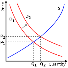
A common and specific example is the supply-and-demand graph shown at right. This graph shows supply and demand as opposing curves, and the intersection between those curves determines the equilibrium price. An alteration of either supply or demand is shown by displacing the curve to either the left (a decrease in quantity demanded or supplied) or to the right (an increase in quantity demanded or supplied); this shift results in new equilibrium price and quantity. Economic graphs are presented only in the first quadrant of the Cartesian plane when the variables conceptually can only take on non-negative values (such as the quantity of a product that is produced). Even though the axes refer to numerical variables, specific values are often not introduced if a conceptual point is being made that would apply to any numerical examples.
More generally, there is usually some mathematical model underlying any given economic graph. For instance, the commonly used supply-and-demand graph has its underpinnings in general price theory—a highly mathematical discipline.
Choice of axes for dependent and independent variables edit


In most mathematical contexts, the independent variable is placed on the horizontal axis and the dependent variable on the vertical axis. For example, if f(x) is plotted against x, conventionally x is plotted horizontally and the value of the function is plotted vertically. This placement is often, but not always, reversed in economic graphs. For example, in the supply-demand graph at the top of this page, the independent variable (price) is plotted on the vertical axis, and the dependent variable (quantity supplied or demanded), whose value depends on price, is plotted horizontally.
However, when time is the independent variable, and values of some other variable are plotted as a function of time, normally the independent variable time is plotted horizontally, as in the line graph to the right.
Yet other graphs may have one curve for which the independent variable is plotted horizontally and another curve for which the independent variable is plotted vertically. For example, in the IS-LM graph shown here, the IS curve shows the amount of the dependent variable spending (Y) as a function of the independent variable the interest rate (i), while the LM curve shows the value of the dependent variable, the interest rate, that equilibrates the money market as a function of the independent variable income (which equals expenditure on an economy-wide basis in equilibrium). Since the two different markets (the goods market and the money market) take as given different independent variables and determine by their functioning different dependent variables, necessarily one curve has its independent variable plotted horizontally and the other vertically.