
-
![Roman type on Plantin's specimen of c. 1585[25]](//upload.wikimedia.org/wikipedia/commons/thumb/9/99/Granjon_Petit_Canon_Romain_from_Plantin_specimen_c._1585_page_4.jpg/180px-Granjon_Petit_Canon_Romain_from_Plantin_specimen_c._1585_page_4.jpg) Roman type on Plantin's specimen of c. 1585[25]
Roman type on Plantin's specimen of c. 1585[25] -
 Italic and Greek types
 -
![Italic capitals by Granjon with swash alternate characters[26]](//upload.wikimedia.org/wikipedia/commons/thumb/0/0a/Granjon_italic_capitals.jpg/138px-Granjon_italic_capitals.jpg)
-
 Granjon's Ascendonica italic in a book.
 -
 Title page of Dialogue de la vie et de la mort, printed and published by Granjon in his "lettre francoise" (Civilité) type, 1558.
 -
 Text page of Dialogue de la vie et de la mort, announcing the royal privilege
 -
 Plantin's type specimen of 1567, using Granjon's fleurons as the border
 -
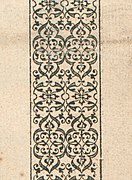 Detail of Granjon's fleuron design

KNOWPIA
WELCOME TO KNOWPIA
Robert Granjon 
Summary
Robert Granjon (Paris, c. 1513 - Rome, 1590) was a French punchcutter, a designer and creator of metal type, and printer.[1][2][3] He worked in Paris, Lyon, Antwerp, and Rome.[1] He is best known for having introduced the typeface style Civilité, for his many italic types and his fleuron designs, although he worked across all genres of typeface and alphabet across his long career.[1][4][5][6][7]

Career edit
The son of Parisian bookseller and printer Jean Granjon,[3] he married the daughter of wood engraver Bernard Salomon.[8][9]
In 1557, he introduced his "lettre francoise" type, now generally called "Civilité". It was based on contemporary French handwriting. The first book he published using it was Dialogue de la vie et de la mort by Ringhieri in 1557.[10] In a preface, he wrote that he hoped it would be a national letter style for the French language comparable to those of the "Hebrews, Greeks [and] Romans".[11] He had received from Henry II an exclusive privilege to use the type for ten years,[12] although it was apparently not enforced, as Philippe Danfrie and Richard Breton quickly brought out an imitation.[13][14]
Granjon's influential italic types had sloped roman capitals and a greater slope angle than some earlier italics in the Aldine style.[15][16]
In Paris and Lyons he printed several books of music.[17] Granjon's types were widely distributed across Europe. His Greek types, in the style of Claude Garamond's Grecs du roi types, were also very widely used.[18]
By 1579, he had moved to Rome.[19] There he worked on types for Oriental characters needed by the Catholic missionaries: Armenian (1579),[20] Syriac (1580), Cyrillic (1582), and Arabic (1580-86). He collaborated with Giambattista Raimondi, the scientific director of the Stamperia Medicea Orientale,[21] and Domenico Basa, the technical director of the Stamperia Vaticana, and contributed to the earliest printed editions in certain Oriental languages.[22][21] He died in 1590 and was buried in the Trinità dei Monti church.[23]
His name continued to be known in the printing trade for the century after his death: in 1667 the Amsterdam merchant Paul le Conte claimed (dubiously, according to John A. Lane) that all his matrices were made by Granjon.[24]
![Roman type on Plantin's specimen of c. 1585[25]](http://upload.wikimedia.org/wikipedia/commons/thumb/9/99/Granjon_Petit_Canon_Romain_from_Plantin_specimen_c._1585_page_4.jpg/180px-Granjon_Petit_Canon_Romain_from_Plantin_specimen_c._1585_page_4.jpg)

![Italic capitals by Granjon with swash alternate characters[26]](http://upload.wikimedia.org/wikipedia/commons/thumb/0/0a/Granjon_italic_capitals.jpg/138px-Granjon_italic_capitals.jpg)


Many of Granjon's punches and matrices are preserved.[27]
-
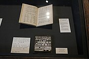
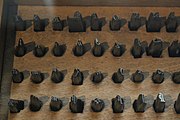 Italic punches in the Plantin-Moretus Museum
 -
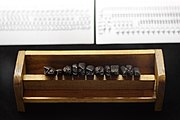
 Ascendonica Cursive matrices, capitals
 -
 Ascendonica Cursive matrices, lower case
 -
 Old Syriac characters
 -
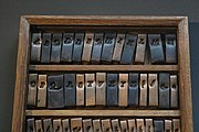
 Punches for printing in Arabic, Imprimerie Nationale collection


Typefaces inspired by Granjon’s work edit

Many modern typerfaces are influenced by the designs of Robert Granjon. One of the first deliberate revivals of Granjon's type was Plantin by Frank Hinman Pierpont.[28][29] Despite being named after Renaissance printer Christophe Plantin, it is based on a Gros Cicero type which is designed by Robert Granjon.[30][31][32][33][34]
ITC Galliard by Matthew Carter, Allrounder Antiqua by Moritz Kleinsorge and Romaine by Aad van Dommelen are based on Granjon’s Ascendonica Romaine.[35][36][37][38]
Lyon Text by Kai Bernau and Graveur by Juanjo López are also influenced by Granjon’s works.[39][40] Graveur is not based on one single specimen, but instead a combination of multiple types by Granjon, including Parangonne Romaine and Ascendonica Romaine for its roman characters.[41]
The roman characters of MVB Verdigris by Mark van Bronkhorst are based on Granjon’s designs, while its italics are inspired by the works of Pierre Haultin.[42]
Garamond revivals edit
Because Granjon's italics were very widely used, many typefaces branded as "Garamond" use italics based on Granjon's work. Specific examples include Adobe Garamond, Garamond Premier, Sabon, Sabon Next, Granjon, and EB Garamond. [43][44][45][46][47]
References edit
- ^ a b c Vervliet 2008, p. 322.
- ^ Vervliet 2008, pp. 430–434.
- ^ a b Lane 2004, p. 39.
- ^ Janssen, Frans A. (8 November 2019). "Robert Granjon, Letter-cutter; 1513-1590: an oeuvre-catalogue, written by Hendrik D. L. Vervliet". Quaerendo. 49 (3): 275–276. doi:10.1163/15700690-12341446.
- ^ Shaw, David (June 2018). "Granjon's Flowers: An Enquiry into Granjon's, Giolito's, and de Tournes' Ornaments, 1542–1586. By Hendrik D. L. Vervliet". The Library. 19 (2): 238–239. doi:10.1093/library/19.2.238.
- ^ Boardley, John (6 June 2020). "Death of a Typeface". i love typography. Retrieved 4 July 2020.
- ^ Gaultney 2021, p. 63.
- ^ Vervliet 2008, p. 431.
- ^ Carter & Vervliet 1966, pp. 8–9.
- ^ Vervliet 2008, pp. 390, 431.
- ^ Carter & Vervliet 1966, p. 11.
- ^ Carter & Vervliet 1966, p. 19.
- ^ Carter & Vervliet 1966, p. 24.
- ^ Vervliet, Hendrik D L (March 2020). "Danfrie Reconsidered. Philippe Danfrié's (d. 1606) Civilite Types". The Library. 21 (1): 3–45. doi:10.1093/library/21.1.3.
- ^ Gaultney 2021, p. 151.
- ^ Vervliet 2008, pp. 322–323.
- ^ Pogue, Samuel F. & Dobbins, Frank (2001). "Robert Granjon". In Sadie, Stanley & Tyrrell, John (eds.). The New Grove Dictionary of Music and Musicians (2nd ed.). London: Macmillan Publishers. ISBN 978-1-56159-239-5.
- ^ Lane 1996, p. 111.
- ^ Vervliet 2008, p. 436.
- ^ Papassissa 2019, pp. 57–69.
- ^ a b Vervliet 2008, p. 433.
- ^ Rome Reborn: The Vatican Library & Renaissance Culture/ Orient to Rome
- ^ Vervliet 2008, p. 432.
- ^ Lane 2013, p. 367.
- ^ Vervliet & Carter 1972.
- ^ Vervliet 2008, p. 350.
- ^ Vervliet 2008, pp. 230, 354, etc.
- ^ Slinn, Judy; Carter, Sebastian; Southall, Richard. History of the Monotype Corporation. pp. 202–3 etc.
- ^ "Identifont - Robert Granjon". Retrieved 2022-02-16.
- ^ "Monotype Plantin: A Digital Revival by Brigitte Schuster" (PDF). Retrieved 2022-02-16.
- ^ Morison, Stanley (7 June 1973). A Tally of Types. CUP Archive. pp. 22–24. ISBN 978-0-521-09786-4.
- ^ Dreyfus, John (1995). Into Print: Selected Writings on Printing History, Typography and Book Production (1st hardcover ed.). Boston: David R. Godine. pp. 116–124. ISBN 9781567920451.
- ^ Vervliet 2008, pp. 226–7.
- ^ Mosley, James. "Comments on Typophile thread". Typophile (archived). Archived from the original on 2011-10-13. Retrieved 16 December 2016.
- ^ Mosley, James (2003). "Reviving the Classics: Matthew Carter and the Interpretation of Historical Models". In Mosley, James; Re, Margaret; Drucker, Johanna; Carter, Matthew (eds.). Typographically Speaking: The Art of Matthew Carter. Princeton Architectural Press. pp. 31–34. ISBN 9781568984278.
- ^ "ITC Galliard Font". Retrieved 2022-02-18.
- ^ "Allrounder Antiqua Font". Retrieved 2022-02-16.
- ^ "Romaine - Fontwerk". Retrieved 2022-02-16.
- ^ "Commercial Type » Catalog » Lyon Text Family". Commercial Type. Retrieved 2022-02-16.
- ^ "Graveur". Retrieved 2022-02-16.
- ^ "Designing a Revival: Graveur".
- ^ "MVB Verdigris Pro Font".
- ^ "Just what makes a Garamond a Garamond?". Retrieved 2022-02-16.
- ^ "Granjon". Retrieved 2022-02-16.
- ^ "GitHub - octaviopardo/EBGaramond12". GitHub. Retrieved 2022-02-26.
- ^ Adobe Garamond Pro specimen book (PDF). San José: Adobe Systems. 1989. Archived from the original (PDF) on 23 February 2015. Retrieved 9 March 2014.
- ^ Brady, Fred; Blumberg, Gail; Huggins, Cleo; Stauffacher, Jack; Stone, Sumner; Szujewsksa, Laurie; Wang, Min (2000). Adobe Garamond. San José: Adobe Systems.
Sources edit
- Carter, Harry; Vervliet, H. D. L. (1966). Civilité types. Oxford Bibliographical Society/Oxford University Press.
- Carter, Harry; Morison, Stanley (1967). Sixteenth-century French Typefounders: The Le Bé memorandum. Private printing for A. Jammes.
- Carter, Harry, ed. (1969). The type specimen of Delacolonge. Les caractères et les vignettes de la fonderie du sieur Delacolonge, Lyons, 1773. Introduction and notes by Harry Carter. (Facsimile ... made from a copy belonging to the publishers.).
- Carter, Harry (2002). Mosley, James (ed.). A View of Early Typography Up to About 1600 (Reprinted ed.). London: Hyphen Press. ISBN 978-0-907259-21-3.
- Dreyfus, John, ed. (1963). Type Specimen Facsimiles. London: Bowes & Bowes, Putnam.
- Gaultney, Victor (2021). Designing Italics: Approaches to the design of contemporary secondary text typefaces (PhD thesis). University of Reading. Retrieved 30 September 2021.
{{cite book}}:|website=ignored (help) - Lane, John A. (1996). "From the Grecs du Roi to the Homer Greek: Two Centuries of Greek Printing Types in the Wake of Garamond". In Macrakis, Michael S. (ed.). Greek Letters: From Tablets to Pixels. Oak Knoll Press. ISBN 9781884718274.
- Lane, John A. (2004). Early Type Specimens in the Plantin-Moretus Museum: annotated descriptions of the specimens to ca. 1850 (mostly from the Low Countries and France) with preliminary notes on the typefoundries and printing offices (1. ed.). New Castle, Del.: Oak Knoll Press. ISBN 9781584561392.
- Lane, John A. (2005). "Claude Garamont and his Roman Types". Garamond Premier Pro: a contemporary adaptation; modelled on the roman types of Claude Garamond and the italic types of Robert Granjon. San Jose: Adobe Systems. pp. 5–13.
- Lane, John A. (2012). The Diaspora of Armenian Printing, 1512-2012. Amsterdam: Special Collections of the University of Amsterdam. pp. 70–86, 211–213. ISBN 9789081926409.
- Lane, John A. (27 June 2013). "The Printing Office of Gerrit Harmansz van Riemsdijck, Israël Abrahamsz de Paull, Abraham Olofsz, Andries Pietersz, Jan Claesz Groenewoudt & Elizabeth Abrahams Wiaer c.1660–1709". Quaerendo. 43 (4): 311–439. doi:10.1163/15700690-12341283.
- Papassissa, Elena (2019). Conventions, traditionalism, Latinisation, and modernity in Armenian typefaces across type-making technologies from 1512 to 1977 (PDF). University of Reading (PhD thesis). Retrieved 7 January 2023.
- Shaw, Paul (18 April 2017). Revival Type: Digital Typefaces Inspired by the Past. Yale University Press. pp. 48, 61. ISBN 978-0-300-21929-6.
- Slimbach, Robert (2005). "The Making of Garamond Premier". Garamond Premier Pro: a contemporary adaptation; modelled on the roman types of Claude Garamond and the italic types of Robert Granjon. San Jose: Adobe Systems. pp. 15–21.
- Vervliet, Hendrik D. L.; Carter, Harry, eds. (1972). Type Specimen Facsimiles II. University of Toronto Press. pp. 7–11.
- Vervliet, Hendrik D. L. (2008). "Printing Types of Pierre Haultin, c. 1510-1587". The Palaeotypography of the French Renaissance: Selected Papers on Sixteenth-century Typefaces. BRILL. pp. 243–286. ISBN 978-90-04-16982-1.
- Vervliet, Hendrik D. L. (2010). French Renaissance Printing Types: a Conspectus. New Castle, Del.: Oak Knoll Press. ISBN 978-1-58456-271-9.
- Vervliet, Hendrik D. L. (2016). Granjon's flowers: an enquiry into Granjon's, Giolito's, and De Tournes' ornaments, 1542-86 (First ed.). New Castle: Oak Knoll Press. ISBN 9781584563556. Retrieved 2 July 2020.
- Vervliet, Hendrik D. L. (2018). Robert Granjon, letter-cutter (1513-1590): an oeuvre-catalogue (First ed.). New Castle: Oak Knoll Press. ISBN 9781584563761. Retrieved 2 July 2020.
- Maurits Sabbe, Marius Audin. Die Civilité-Schriften des Robert Granjon in Lyon: und die flämischen Drucker des 16. Jahrhunderts. Vol. 3 of Bibliotheca typographica, Bibliotheca Typographica, 1929.