


Summary
Thai typography concerns the representation of the Thai script in print and on displays, and dates to the earliest printed Thai text in 1819. The printing press was introduced by Western missionaries during the mid-nineteenth century, and the printed word became an increasingly popular medium, spreading modern knowledge and aiding reform as the country modernized. The printing of textbooks for a new education system and newspapers and magazines for a burgeoning press in the early twentieth century spurred innovation in typography and type design, and various styles of Thai typefaces were developed through the ages as metal type gave way to newer technologies. Modern media is now served by digital typography, and despite early obstacles including lack of copyright protection, the market now sees contributions by several type designers and digital type foundries.

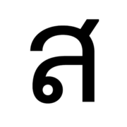
The printed Thai script has characters in the line of text, as well as combining characters that appear above or below them. One of the main distinguishing features among typefaces is the head of characters, also referred to as the terminal loop. While these loops are a major element of conventional handwritten Thai and traditional typefaces, the loopless style, which resembles sans-serif Latin characters and is also referred to as Roman-like, was introduced in the 1970s and has become highly popular. It is widely used in advertising and as display typefaces, though its use as body-text font has been controversial. Classification systems of Thai typefaces—primarily based on the terminal loop—have been proposed, as has terminology for type anatomy, though they remain under development as the field continues to progress.
History edit
First printing of Thai edit

Prior to the introduction of printing, Thai script had evolved along a calligraphic tradition, with most written records in the form of folding-book manuscripts known as samut khoi.[1] Records mentioning printing first appear during the reign of King Narai (1656–1688) of the Ayutthaya Kingdom, though the first documented printing of the Thai language did not occur until 1788, in the early Rattanakosin period, when the French Catholic missionary Arnaud-Antoine Garnault had a catechism and a primer printed in Pondicherry in French India. The texts, printed in romanized Thai, were distributed in Siam, and Garnault later set up a printing press in Bangkok.[2]
The printing of Thai script was pioneered by Protestant missionaries. In 1819, Ann Hasseltine Judson, an American Baptist missionary based in Burma, translated the Gospel of Matthew, as well as a catechism and a tract, into Thai.[2] She had learned the language from settled Thai war captives who had been relocated following the fall of Ayutthaya in 1767. The catechism was printed at the Serampore Mission Press in Danish-controlled Serampore, on the outskirts of Calcutta, at the end of the year. It is the earliest known printing of the Thai script, though no remaining copies have been found.[2] The type was probably cast by mission printer George H. Hough, who had worked with the Judsons in Burma. The same font may have later been used in 1828 to print A Grammar of the Thai or Siamese Language by East India Company Captain James Low.[3][4] The book was printed at the Baptist Mission Press in Calcutta, an offshoot of the Serampore mission, and is the oldest known extant printed material in the Thai script.[2]
In 1823, a set of the font was purchased by Samuel Milton for the London Missionary Society (LMS)'s printing operations in Singapore.[2] The LMS press did not see much Thai output until the early 1830s, when Protestant missionaries began taking up residence in Bangkok. Karl Gützlaff's translation of the Gospel of Luke was printed in 1834, and is the earliest surviving printing of the Bible in the Thai script.[2][5] The type used is clearly different from that of Low's grammar, and may have been a newer font cast later.[4]
Introduction to the country edit

Thai-script printing reached Siam when the American missionary doctor Dan Beach Bradley arrived in Bangkok in 1835, bringing with him from the Singapore printing operation (which had been acquired by the American Board of Commissioners for Foreign Missions (ABCFM) the year before) an old printing press, together with a set of Thai type.[2] Bradley, working with a few other missionaries, successfully operated the press the following year. They were soon joined by a printer from the Baptist Board for Foreign Missions, who brought new printing equipment, and thus were able to start producing religious material for distribution. The ABCFM and Baptist ministries later established separate printing houses, but initially, they relied on sharing the original set of type brought from Singapore.[2] The missionaries initially ordered new type from Singapore and Penang, but they found the quality unsatisfactory. They finally succeeded in casting their own type in 1841.[6][7]
Although the missionaries saw limited success in proselytizing, their introduction of printing had far-reaching effects, and Bradley in particular became well known as a printer and produced many influential secular works. In 1839, the government of King Rama III hired the ABCFM press to produce the country's first printed official document: 9,000 copies of a royal edict prohibiting the use or sale of opium.[a][2][7] Bradley authored and printed several medical treatises, launched the first Thai-language newspaper—the Bangkok Recorder—in 1844, and published several books, including Nirat London—the first Thai work for which copyright fees were paid—in 1861.[3] His press gained the attention of elite Thais, especially Prince Mongkut (who was then ordained as a monk and would later become King Rama IV), who set up his own printing press at Wat Bowonniwet, cast his own Thai type, and created a new script, known as Ariyaka, to print the Pali language used for Buddhist texts.[b][2][6] When he became king in 1851, Mongkut established a royal press in the Grand Palace, which printed official publications including the newly established Royal Gazette.[3][6]
The earliest typefaces used by these printing establishments were based on the handwriting style of the period, and accordingly featured mostly angular shapes in a single thickness, and were slanted throughout. As Bradley refined his craft, he shifted to upright types with outlines in the shape of vertical rectangles (as seen used in the Bangkok Recorder), and later, with Nirat London, introduced rounded curves. His work would greatly influence later printers.[1][8]
Expansion edit
The introduction of printing paved the way for the modernization of the country under the reign of Mongkut's successor Chulalongkorn (King Rama V, r. 1868–1910). Bradley was joined in the field by Samuel J. Smith and several other printers in the 1860s, and they started a trend of book publishing, producing numerous books of fact as well as popular literature.[6][9] The widespread circulation of texts which had previously been confined to manuscripts transformed society's conception of knowledge. Dozens of private printing enterprises arose during the following decades, and the Vajirañāṇa Library was established as a central repository of knowledge as well as a publishing regulator: it oversaw the production of a new genre of books known as cremation volumes, and in effect helped standardize the language's orthography. A distinctive typeface from this period is now known as Thong Siam, named for its use in the Flag Regulations for the Kingdom of Siam, printed in 1899 by W. Drugulin in Leipzig, Germany.[9]
The typewriter was also introduced to the country around this time. The first Thai-language typewriter was developed by Edwin McFarland in 1892. Typewriters became widely adopted by the government, and helped transform the country's administration into a modern bureaucracy. They also modified the language. Since the typewriters of the day were unable to accommodate all Thai characters, McFarland decided to exclude two less-used consonants—kho khuat and kho khon—leading to their eventual obsolescence.[10][11]
The first formal schools were established during Chulalongkon's reign, and as basic education further expanded under his successor Vajiravudh (King Rama VI, r. 1910–1925), so did demand for textbooks to facilitate teaching. Several printing houses specialized in the production of schoolbooks, among them Aksoranit Press, whose typeface Witthayachan is notable for the period. The Catholic Mission of Bangkok was also influential in pioneering education, and established Assumption College, one of the oldest schools in the country. Among the works printed by its Assumption Press are the primary-school Thai textbook Darunsuksa by the French priest and teacher F. Hilaire, which was first published in 1914 and remains in print over a century later. The press's preferred typeface, Farang Ses, designed in 1913, was the first to employ thick and thin strokes reflecting old-style serif Latin typefaces, and became extremely popular, with its derivatives widely used into the digital age.[12]

The reign of Vajiravudh also saw the beginnings of a flourishing press, and the newspaper industry underwent explosive growth into the 1930s, followed closely by pulp magazines.[13][14] The new stage for public discourse contributed to the abolition of absolute monarchy in 1932, and as newspapers became more politically vocal, demand rose for large display types for their headlines. Many new fonts were created, mostly influenced by the wood-carved style introduced by Chinese immigrants, who dominated the market as dedicated type foundries were opened. Printing and typesetting became an established craft, and dedicated trade schools began teaching in 1932. Italic (or oblique) type was introduced, with the earliest example found in 1925,[13] and bold type after World War II, but apart from more refined font sizes, not much innovation was seen in regard to body-text typefaces for several decades. Meanwhile, a trend emerged in the form of craft shops offering services creating custom hand-drawn decorative text for copperplate printing. An angular, blocky text style emerged during this period, and was use especially for magazine covers and logotype.[14] It also became popular in sign-making, mostly replacing the Blackletter-like Naris style (named after its designer Prince Naris) that had been in use since the late nineteenth century.[15][16]
Transition from metal type edit
Between 1957 and 1962, the printing technologies of hot metal typesetting and phototypesetting were introduced by major publishers. Thai Watana Panich (TWP) adopted the Monotype system, and partnered with the Monotype Corporation to develop Thai Monotype typefaces for its use. Around the same period, Kurusapa Press (the printing business of the Ministry of Education) developed the Kurusapa typeface for use with photocomposing machines, and the Ministry of Education received a grant from the Tokyo Book Development Centre and the UNESCO to develop a new typeface, now known as Unesco. These typefaces similarly featured a uniform stroke width and smooth curves, but mostly failed to gain traction among the wider industry, and the Monotype system soon became obsolete with the advent of offset printing. An exception was Thai Medium 621, which was adopted for TWP's schoolbooks, became widely recognized, and remained popular into the following decades.[17]
The 1970s brought dry-transfer lettering, introduced to Thailand by DHA Siamwalla through a partnership with Mecanorma of the Netherlands. Compatibility with the new offset-printing technology helped boost its popularity for creating display lettering in advertising, news printing, and the creation of political materials, especially during the 1973–1976 democracy movement. Most of the fonts were designed by Manop Srisomporn, who made a major innovation in the form of loopless characters, which abandoned conventional letter shapes for simple, minimalist forms. The best known of these typefaces, Manoptica, was designed to invoke the characteristics of the sans-serif typeface Helvetica, and was released in 1973. The style, widely perceived as modern and trendy, became extremely popular, especially in advertising, and remains so to the present.[18]
Among publishers, phototypesetting became widely adopted in the 1970s–1980s, marking the end of metal type in the Thai publishing industry. Thairath, the country's best-selling newspaper, developed new typefaces for use with its Compugraphic machines in 1974. Tom Light, designed by Thongterm Samerasut and released by the East Asiatic (Thailand) Company, was created as a body-text font for the newspaper, and featured geometrical designs invoking a sense of modernity. More typefaces, including ChuanPim, UThong and Klonglarn, emerged at the end of the decade.[19]
Digital typography edit

Computer systems with Thai-language support were introduced in the late 1960s in the form of card-punch machines and line printers by IBM. On-screen interactive display of Thai text became available in the 1980s, and DOS-based word processors such as CU Writer, released in 1989, saw widespread adoption.[21] The advent of desktop publishing arrived with the Apple Macintosh, which was first imported in 1985 by Sahaviriya OA, who also developed the first Thai computer fonts in PostScript format. More refined typefaces were soon released by emerging dedicated type design companies, notably the DB series by Suraphol Vesaratchavej and Parinya Rojarayanond of Dear Book (later known as DB Design), and the PSL series by PSL SmartLetter. These new typefaces, as well as digital fonts based on earlier classic types, were widely adopted as the media industry boomed amidst rapid economic growth, until halted by the 1997 financial crisis.[22]
During this early period of computerization, the proliferation of software systems led to interoperability issues, prompting NECTEC (Thailand's central computer research institute) to issue several standards covering language handling. For TrueType fonts, proper positioning of some combining characters required the use of private use area glyphs, but these were defined differently between Windows and Mac OS systems, causing font files for each to be incompatible. Certain software, especially those by Adobe, had long-standing issues with above-line mark positioning. The adoption of the OpenType format is expected to alleviate the issue.[21]
Copyright regulations also lagged behind the rapid innovation and spread of information, and type designers had difficulty commercializing their work, leading to a slump following the initial period.[23] Even after new copyright law that provided protection for computer programs was issued in 1994, the copyrightability of typefaces remained unclear. The issue came to the forefront in 2002, when PSL began suing publishers who used its fonts unlicensed for copyright infringement. This led to heated discussions and conflicts with the publishing industry, who believed font designs to be in the Public Domain and saw PSL's practice as predatory litigation. Ultimately, the campaign led to a new awareness and acceptance of computer fonts as a copyright-protected good, especially as the Intellectual Property and International Trade Court made a ruling in favour of PSL in 2003 that fonts were protected as computer programs.[20][24]

One of the responses to the issue was a proliferation of freely licensed computer fonts. Earlier, in 2001, NECTEC had released three such typefaces, Kinnari, Garuda and Norasi, under its National Fonts project, intending them as public alternatives to the widely used, yet licence-restricted, commercial typefaces that came bundled with major operating systems and applications.[23] (For Windows systems, these were the UPC series of fonts by Unity Progress, which were based on major earlier types.) The project was expanded upon in 2007, when the Software Industry Promotion Agency together with the Department of Intellectual Property released thirteen typefaces following a national competition. Most notable among them is Sarabun, which in 2010 was made the official typeface for all government documents, replacing the previous de facto standard Angsana (a UPC font family derived from Farang Ses).[25] The community website F0nt.com, which hosts freely licensed fonts mostly by amateurs and hobbyists, was established in 2004.[26] Trade associations of the printing industry also later released their own freely licensed typefaces.[20]
The changed landscape led to a gradual resurgence in digital type design, with new players joining the market, including Cadson Demak, which focuses on custom designs for corporate users. Anuthin Wongsunkakon, one of the company's 2002 co-founders, had designed among the first custom fonts in the market for AIS, one of Thailand's three main mobile operators, who wished to build a stronger brand identity at a time when all three companies shared the same font in their marketing material.[27][28] The industry grew from then, and the fields of digital typography and type design saw increased public awareness, especially in the 2010s. In 2013, Thailand's twelve digital type foundries joined up to found Typographic Association Bangkok to promote the industry.[29][30][31] Among the trends seen during this period is a sharp rise in popularity of the loopless or Roman-like style introduced by Manop, which began seeing use as body text in some magazines in 1999. Type designers have also introduced Thai typefaces with wider ranges of font weight, mostly in the loopless style, though their use continues to be a point of debate.[1][32]
Type anatomy edit
There is not yet a single standard terminology for Thai typeface anatomy, and type designers have variably observed several features: Parinya in 2003 described six: heads, tails, mid-stroke loops, serrations, beaks, and flags.[25][32] Other authors have also mentioned the stroke/line, pedestals/feet, and spurs/limbs.[1][33]

- Head
- The head, also described as the first or terminal loop, is one of the most distinguishing features of Thai script, and conventionally appears as simple loops (e.g. บ), curled loops or crowns (ข), and kinked/serrated crowns (ฃ). It may either face left or right, and may appear top (พ/ผ), bottom (ภ/ถ), or in the middle of the character (ด/ค).
- Tail
- The tail appears as ascenders (e.g. ป), descenders (ฤ), arch/oblique tails (ศ), looped/coiled tails (ฬ), and a middle tail (ษ). They mostly project above the mean line or below the baseline.
- Mid-stroke loop
- The mid-stroke or second loop can be at the top (touching the mean line, e.g. ห) or the bottom (touching the baseline, ม)
- Serration
- Serration or broken lines, apart from in the crown, is found in the canopy (e.g. ต) and the looped descender tail of ฏ.
- Beak
- The beak appears in several characters (e.g. ก), with a single appearance, though designs vary among typefaces.
- Flag
- The flag, or double-storey line, is used in the consonants ฐ, ธ, ร and the vowel โ. It does not form a contrasting feature against other characters.
- Stroke
- Features of the stroke or line include stems (vertical front, back, or middle lines), canopies or upper lines (usually as an arch), bases or lower lines (a horizontal stroke along the baseline), oblique lines, and creases or stroke reversals.
- Pedestal
- The pedestal or foot is found in a few characters, either attached to the descender as part of the tail (ฎ and ฏ), or unattached (ญ and ฐ)
- Spur
- The spur or limb is an element found in some typefaces. It appears like a serif at the angle of the base of some characters.
Typeface styles and classification edit
The established conventional handwriting styles of Thai script fall broadly into two categories: angular and rounded, with the former forming the majority. The angular styles, in common use until at least the mid-twentieth century, are probably derived from the manuscript traditions of the early Rattanakosin period (though they have lost the marked slant found in most historical manuscripts). The Alak calligraphic style, in particular, is still associated with the royal scribes' artistic tradition, and is used for the official manuscript editions of the constitution.[1][25]
Thai typefaces can likewise be classified as angular or round, although the majority of today's typefaces are in the rounded style and thus the distinction no longer usefully reflects typographical usage. Most Thai typefaces also include characters for the basic Latin script, and some applications classify them as serif or sans-serif based on their Latin characters, though this often has little bearing on their Thai counterparts. More often, typefaces are mainly categorized based on the shape of the head of Thai characters, i.e. whether or not the font features the traditional loop. While earlier designs that truncate or omit the loop had been used in sign-making and as decorative text since the nineteenth century, it is the Roman-like loopless style introduced in the 1970s that has received the most attention in the age of digital type design.[1]
Thai type classification is still undergoing development, with input from several organizations and academics. While the Royal Institute and NECTEC had included classification systems in their typeface-design guidelines released in 1997 and 2001, they were not widely adopted, and a standard system has not been agreed upon.[25][34] More recently, design company Cadson Demak has contributed to a classification model that assigns typefaces to three main categories—traditional (looped), display (topical) and modern (loopless)—with several subcategories to each.[1]
Traditional edit
Typefaces of the traditional or looped category are distinguished by the looped terminal as the character head, reflecting the conventional handwriting styles after which the earliest types were designed. They are subcategorized into the following styles:[1]
-
 Handwriting
 -
 Old style
 -
 Wood type
 -
 Humanist
 -
 Geometric
 -
 Geometric humanist
 -
 Neo-geometric


- Handwriting
- This style includes most early fonts, as well as those directly influenced by calligraphic handwriting styles, and many of them feature angular letter shapes. Today they are used, mainly as display type, to convey a sense of venerability. (Examples: Bradley Square, Bradley Curved, Thong Siam)
- Old style
- Influenced by old-style serif Latin typefaces and typified by 1913's Farang Ses, this style employs contrasting thick and thin strokes, and was used for government documents into the 2000s. (Examples: Angsana UPC, Kinnari)
- Wood type
- Developed as display type for large headlines in the 1930s, the style was introduced by Chinese immigrants, and some probably appeared as wood type before being cast in metal. (Examples: DB Zair, DB PongMai, DB PongRong)
- Humanist
- First created by Monotype for Thai Watana Panich's school textbooks, this style is influenced by Western humanist sans-serif typefaces and employs monoline strokes with a crisp appearance. (Examples: Monotype Thai Medium 621, TF Pimai, Browallia UPC, Garuda)
- Geometric
- This style employs geometric designs to create a futuristic appearance, with influences from geometric sans-serif Latin typefaces. The style's original type, Tom Light, was first designed as body-text font for the Thairath newspaper. (Examples: Tom Light (C-1), EAC Tomlight, Cordia UPC)
- Geometric humanist
- The style was introduced with ChuanPim, which was the first typeface created with the specific consideration of allowing it to blend in together with Latin script. (Example: EAC Chuanpim)
- Neo-geometric
- Typified by ThongLor, created by Cadson Demak with more white space to allow for increases in font weight, the style features a modular design, with strokes in separate segments. (Example: ThongLor)
Display edit
The display category includes typefaces derived from styles of originally hand-drawn display lettering, which were purpose-made for uses including signage, book covers, and labels. They are subcategorized into two genres: script and decorative. The script type features letters distinctively shaped by their writing implement, while the decorative genre covers a large variety of designs, including those incorporating traditional patterns or stylized motifs. A prominent style among the script genre is Blackletter, while constructivism is one of the major decorative styles.[1]
-
 Blackletter
 -
 Constructivism


- Blackletter
- Also known as the ribbon style following its appearance of thick and thin lines formed by a broad-nibbed pen, it has been widely used for display signage since the nineteenth century. Best known among them is the Naris style, which has been recreated as a digital typeface. (Examples: Thai Naris, ABC Burgbarn)
- Constructivism
- This angular, blocky style, with its high visual impact, was widely used for pulp magazine covers, and was also preferred by the People's Party regime that followed the abolition of absolute monarchy, though it fell out of favour in official usage after World War II.[15] The style has inspired some digital typefaces. (Examples: Tualiam, 9 LP)
Modern edit
Typefaces of the modern or loopless category are also referred to as Roman-like, reflecting their original inspiration of mimicking the appearance of sans-serif Latin typefaces. They are defined by the lack of distinct terminal loops, though some may not be completely loopless. There are three subcategories:[1]
-
 Modern
 -
 Crossover


- Modern
- The modern style emerged with dry-transfer lettering, with Manoptica considered its main progenitor. The minimalist, loopless design evokes characteristics of sans-serif typefaces, and were designed primarily as display type. (Examples: Manoptica, Manop Mai)
- Obscure loop
- Typefaces of this style feature highly reduced character heads which appear as a small slab or nib, which still help enhance legibility. They include the first loopless typefaces to be used for body-text. (Examples: LC Manop, PSL Display)
- Crossover
- These typefaces were created in the digital age, and many support greater weight gradation, allowing for the development of extended font families. They may be considered flexible enough to be used for both display and text. (Example: Sukhumvit)
Usage and considerations edit
The proper display of Thai text on computer systems requires support for complex text rendering. Thai script consists of inline base characters (consonants, vowels and punctuation marks) and combining characters (vowels, tone marks and miscellaneous symbols) that are displayed above or below them, generally separated into four vertical levels (the baseline, two above, and one below). With mechanical typewriters, each character had a fixed vertical position, with the tone marks in the topmost level. In traditional and digital typesetting, they are shifted downwards if the second level is unoccupied, and above-line marks are shifted slightly leftwards to make way for the base character's ascender, if it has one. Two consonants have unattached pedestals, which are removed when combined with below-line vowels. Thai is written without spaces between words, and word splitting is required to determine the proper placement of line breaks.[21] Justified text alignment, if desired, must be achieved by distribution, increasing the spacing between character clusters (i.e. between in-line characters but not the above-and-below marks).[35]

Today, the choice between looped and loopless typeface styles remains among the most major considerations in Thai typography.[28] Generally, the distinction is seen as analogous to the use of serif and sans-serif typefaces in Latin script—looped terminals are seen as aiding legibility, making the style more suited for body text than loopless fonts. However, the comparison is not completely accurate, as the loop is also an important distinguishing feature between several letter pairs, and many typefaces match looped Thai letters with sans-serif Latin characters.[1][25] Nevertheless, the popularity of the loopless Roman-like style, with its connotations of modernity, saw its use expanding, especially since the 2000s, from advertising into other media, including print publications. This has been subject to some controversy. Wallpaper magazine was criticized for using such a typeface as body text when it introduced its Thai edition in 2005, and when Apple adopted one for the user interface of its iOS 7 mobile operating system in 2013, customer complaints led the company to reverse course in a later update.[36][34]
While some designers see the opposition to loopless typefaces as a traditionalist rejection of change, critics claim that their overuse hinders legibility, and may cause confusion due to their similarity with Latin characters. The abbreviation พ.ร.บ.,[c] for example, appears nearly identical to the Latin letters W.S.U. when printed in such typefaces.[32] A 2018 pilot study found that Thai readers were more likely to make errors when reading a test passage printed in Roman-like typefaces compared to ones with conventional loops.[36]
Some designers have attributed the trend to a lack of innovation in the looped typeface category during the past few decades; the majority of text typefaces in wide use were derived from just four major pre-digital types: Farang Ses, Thai Medium 621, Tom Light and ChuanPim.[37] Cadson Demak, itself regarded as a proponent of the loopless style in the 2000s, has since shifted its focus to produce more typefaces with looped terminals.[38] Some of the company's designs, such as the Thai ranges for Neue Frutiger and IBM Plex, are also now designed with both looped and loopless varieties as part of the same font family.[39][40]
Typefaces edit
Only a few common typefaces are known from the days of cast metal type, including Bradley, Thong Siam, Witthayachan, Farang Ses, and the "Pong" display types.[9][12][13] Several more text typefaces are known from the pre-digital era, including Monotype Thai, Unesco, Kurusapa, ChuanPim, UThong and Klonglarn, while Mecanorma's dry-transfer sheets were offered in dozens of typefaces, mostly named after their designers, e.g. Manop 1, Manop 2, etc.[17][19][18]
The number of Thai typefaces exploded in the digital age, reaching about 300–400 by 2001. These computer fonts are usually grouped into series, named after their designer or foundry. The major early typeface series include DB by DB Design, UPC by Unity Progress (several of which are licensed to Microsoft), PSL by PSL SmartLetter, SV by Sahaviriya, JS by JS Technology, and Mac OS fonts designed by Apple (Singapore).[41]
| Name | Designer | Foundry/series | Category | Sample |
|---|---|---|---|---|
| Bradley Curved | DB Design (DB) | Handwriting |  DB Bradley Curved X | |
| Bradley Square | DB Design (DB) | Handwriting |  DB Bradley Angular X | |
| Thong Siam | DB Design (DB) | Handwriting |  DB TongSiam X | |
| Angsana | Unity Progress (UPC) | Old style |  Angsana | |
| EACT | East Asiatic (EAC) | Old style |  EAC Eact | |
| Kinnari | Dear Book | National Fonts | Old style |  Kinnari |
| Narai | Parinya Rojarayanond | DB Design (DB) | Old style |  DB Narai X |
| Norasi | NECTEC | National Fonts | Old style |  Norasi |
| Pimpakarn | Federation of Thai Printing Industries (TF) | Old style |  TF Pimpakarn | |
| Uthong | Manop Srisomporn | East Asiatic (EAC) |  EAC UThong | |
| Komain | East Asiatic (EAC) | Wood type |  EAC Komain | |
| Mahnakorn | Pairoj Teeraprapa | Siamruay (SR) | Wood type |  SR Mahnakorn |
| Pong Mai | DB Design (DB) | Wood type |  DB PongMai X | |
| Zair | DB Design (DB) | Wood type |  DB Zair X | |
| Adirek | Dusit Supasawat | DS | Humanist |  DS AdiRek |
| Browallia | Unity Progress (UPC) | Humanist |  Browallia | |
| Garuda | Unity Progress | National Fonts | Humanist |  Garuda |
| Pimai | East Asiatic (EAC) | Humanist |  EAC Pemai | |
| Pimai | Federation of Thai Printing Industries (TF) | Humanist |  TF Pimai | |
| Thai Text | Parinya Rojarayanond | DB Design (DB) | Humanist |  DB ThaiText X |
| Unesco | East Asiatic (EAC) | Humanist |  EAC Unesco | |
| Klonglarn | Niwat Charoenphon |  Klonglarn | ||
| FongNam | Parinya Rojarayanond | DB Design (DB) | Geometric |  DB FongNam X |
| Tom Light | Thongterm Samerasut | East Asiatic (EAC) | Geometric |  EAC TomLight |
| ChuanPim | Chao Sornsongkram | East Asiatic (EAC) | Geometric humanist |  EAC ChuanPim |
| Fahtalaijone | Pairoj Teeraprapa | Siamruay (SR) | Display |  SR Fahtalaijone |
| Kobori | Panutat Tejasen | JS Technology (JS) | Display |  JS Kobori Allcaps |
| Erawan | Parinya Rojarayanond | DB Design (DB) | Modern |  DB Erawan X |
| Manoptica | Manop Srisomporn | DB Design (DB) | Modern |  DB Manoptica |
| Sumkan Square | DB Design (DB) |  DB Sumkan Square |
People edit

People notable for their contribution to the field of Thai typography and type design include:
- Anuthin Wongsunkakon
- Anuthin co-founded Cadson Demak in 2002, and is considered one of Thailand's leading type designers. He is also a lecturer at the Faculty of Architecture, Chulalongkorn University. He and his company have designed fonts for Apple and Google, as well as many other businesses.[27][42]
- Kamthorn Sathirakul
- Kamthorn (1927–2008) was the director of the Kurusapa Business Organization, and made many contributions to the publishing industry, including introducing offset printing to Thailand. His research and writing led him to be known as a subject expert on the history of Thai printing.[43]
- Manop Srisomporn
- Having invented the modern loopless style of typefaces, Manop's work is among the most influential in Thai type design. His career spans from the age of hand-drawn text to dry transfer to phototype to digital, when he became among the first to design computer fonts, for Sahaviriya OA. He is now retired.[44]
- Pairoj Teeraprapa
- Also known as Roj Siamruay, Pairoj is probably best known from his vernacular style of lettering work for film posters, including 2000's Tears of the Black Tiger, later developed into the typeface SR FahTalaiJone. He received the Silpathorn Award in 2014.[28][45]
- Panutat Tejasen
- Panutat was a medical student at Chiang Mai University in the 1980s, when he began teaching himself programming and developing Thai-language software. He created the JS series of fonts, which are among the earliest Thai typefaces for the PC.[20]
- Parinya Rojarayanond
- Parinya is a co-founder of DB Design, Thailand's first digital type foundry, and pioneered the creation of many Thai PostScript fonts in the early digital age. He received the Silpathorn Award in 2009.[28]
- Pracha Suveeranont
- Pracha is a graphic designer, known for his work with advertising agency SC Matchbox as well as contributions to the field of typographic design. Among his numerous writings on design and culture, his 2002 book and exhibit, 10 Faces of Thai Type and the Nation, helped establish the historical narrative of Thai typography. He received the Silpathorn Award in 2010.[46]
Notes edit
- ^ ABCFM records note that 10,700 copies were printed.
- ^ At the time, Thai Buddhist texts were traditionally written in a variant of the ancient Khmer script known as Khom. The Ariyaka script was later abandoned, and Buddhist texts since King Chulalongkorn's reign have been printed using the Thai script.
- ^ pho ro bo, standing for พระราชบัญญัติ 'act of parliament'
References edit
- ^ a b c d e f g h i j k Gunkloy, Sirin (2020). Tiga: A Latin-Thai type family for news media (PDF) (post-graduate dissertation). École supérieure d'art et de design d'Amiens. pp. 6–37. Retrieved 22 May 2020.
- ^ a b c d e f g h i j Winship, Michael (1986). "Early Thai printing: The beginning to 1851". Crossroads: An Interdisciplinary Journal of Southeast Asian Studies. 3 (1): 45–61. JSTOR 40860231. Partially reproduced in Winship, Michael (January 2008). "The Printing Press as an Agent of Change?". Commonplace: the journal of early American life. Retrieved 22 May 2020.
- ^ a b c Altbach, Philip G.; Hoshino, Edith S., eds. (2015). International Book Publishing: An Encyclopedia. Routledge. pp. 521–530. ISBN 9781134261260.
- ^ a b พจนานุกรมฉบับมติชน (in Thai). Matichon. 2004. pp. 1023–1031. ISBN 9743232648. Partly reproduced in จุฑารัตน์ อัศววัชรินทร์ (4 October 2019). "ตัวพิมพ์ไทยเกิดครั้งแรกในพม่า เชลยที่ถูกพม่าจับช่วงเสียกรุงครั้งที่ 2 เป็นตัวแปรสำคัญ". silpa-mag.com (in Thai). Silpa Wattanatham. Retrieved 22 May 2020.
- ^ Metzger, Bruce M.; Coogan, Michael David, eds. (1993). The Oxford Companion to the Bible. Oxford University Press. p. 774. ISBN 0199743916.
- ^ a b c d "การนำการพิมพ์ตัวอักษรไทยเข้ามาในเมืองไทย". saranukromthai.or.th (in Thai). โครงการสารานุกรมไทยสำหรับเยาวชนฯ. Retrieved 22 May 2020.
"การพิมพ์ของคนไทย". saranukromthai.or.th (in Thai). โครงการสารานุกรมไทยสำหรับเยาวชนฯ. Retrieved 22 May 2020.
"โรงพิมพ์ในเมืองไทย". saranukromthai.or.th (in Thai). โครงการสารานุกรมไทยสำหรับเยาวชนฯ. Retrieved 22 May 2020. - ^ a b "ประวัติการพิมพ์ในประเทศไทย". catholichaab.com (in Thai). Historical Archives, Archdiocese of Bangkok. 18 September 2017. Retrieved 22 May 2020.
- ^ Pracha Suveeranont. "บรัดเล". ๑๐ ตัวพิมพ์ กับ ๑๐ ยุคสังคมไทย (10 Faces of Thai Type and Thai Nation) (in Thai). Thaifaces. Retrieved 22 May 2020. Originally exhibited 18–31 October 2002 at the Jamjuree Art Gallery, Chulalongkorn University, and published in Sarakadee. 17 (211). September 2002.
- ^ a b c Pracha Suveeranont. "ธงสยาม". ๑๐ ตัวพิมพ์ กับ ๑๐ ยุคสังคมไทย (10 Faces of Thai Type and Thai Nation) (in Thai). Thaifaces. Retrieved 22 May 2020. Originally exhibited 18–31 October 2002 at the Jamjuree Art Gallery, Chulalongkorn University, and published in Sarakadee. 17 (211). September 2002.
- ^ Pracha Suveeranont (18 December 2017). "พิมพ์ดีดกับการพิชิตดินแดน (1)". Matichon Weekly (in Thai). Retrieved 3 June 2021.
- ^ Wongsamuth, Nanchanok (6 January 2014). "Key development". Bangkok Post. Retrieved 3 June 2021.
- ^ a b Pracha Suveeranont. "ฝรั่งเศส". ๑๐ ตัวพิมพ์ กับ ๑๐ ยุคสังคมไทย (10 Faces of Thai Type and Thai Nation) (in Thai). Thaifaces. Retrieved 22 May 2020. Originally exhibited 18–31 October 2002 at the Jamjuree Art Gallery, Chulalongkorn University, and published in Sarakadee. 17 (211). September 2002.
- ^ a b c Pracha Suveeranont. "โป้งไม้". ๑๐ ตัวพิมพ์ กับ ๑๐ ยุคสังคมไทย (10 Faces of Thai Type and Thai Nation) (in Thai). Thaifaces. Retrieved 22 May 2020. Originally exhibited 18–31 October 2002 at the Jamjuree Art Gallery, Chulalongkorn University, and published in Sarakadee. 17 (211). September 2002.
- ^ a b Pracha Suveeranont. "คณะช่าง". ๑๐ ตัวพิมพ์ กับ ๑๐ ยุคสังคมไทย (10 Faces of Thai Type and Thai Nation) (in Thai). Thaifaces. Retrieved 22 May 2020. Originally exhibited 18–31 October 2002 at the Jamjuree Art Gallery, Chulalongkorn University, and published in Sarakadee. 17 (211). September 2002.
- ^ a b Pracha Suveeranont (31 March 2017). "'ตัวเหลี่ยม' อัตลักษณ์ความทันสมัย (1)". Matichon Weekly (in Thai). Retrieved 22 May 2020.
Pracha Suveeranont (8 April 2017). "'ตัวเหลี่ยม' อัตลักษณ์ความทันสมัย (2)". Matichon Weekly (in Thai). Retrieved 22 May 2020.
Pracha Suveeranont (21 April 2017). "'ตัวเหลี่ยม' อัตลักษณ์ความทันสมัย (จบ)". Matichon Weekly (in Thai). Retrieved 22 May 2020. - ^ Pracha Suveeranont (30 July 2018). "ยุคคณะราษฎร : โมเดิร์นที่หายไป (2)". Matichon Weekly (in Thai). Retrieved 22 May 2020.
- ^ a b Pracha Suveeranont. "โมโนไทป์". ๑๐ ตัวพิมพ์ กับ ๑๐ ยุคสังคมไทย (10 Faces of Thai Type and Thai Nation) (in Thai). Thaifaces. Retrieved 22 May 2020. Originally exhibited 18–31 October 2002 at the Jamjuree Art Gallery, Chulalongkorn University, and published in Sarakadee. 17 (211). September 2002.
- ^ a b Pracha Suveeranont. "มานพติก้า". ๑๐ ตัวพิมพ์ กับ ๑๐ ยุคสังคมไทย (10 Faces of Thai Type and Thai Nation) (in Thai). Thaifaces. Retrieved 22 May 2020. Originally exhibited 18–31 October 2002 at the Jamjuree Art Gallery, Chulalongkorn University, and published in Sarakadee. 17 (211). September 2002.
- ^ a b Pracha Suveeranont. "ทอมไลท์". ๑๐ ตัวพิมพ์ กับ ๑๐ ยุคสังคมไทย (10 Faces of Thai Type and Thai Nation) (in Thai). Thaifaces. Retrieved 22 May 2020. Originally exhibited 18–31 October 2002 at the Jamjuree Art Gallery, Chulalongkorn University, and published in Sarakadee. 17 (211). September 2002.
- ^ a b c d Pracha Suveeranont (18 June 2018). "ตัวพิมพ์กับยุคฟองสบู่ (1)". Matichon Weekly (in Thai). Retrieved 22 May 2020.
Pracha Suveeranont (19 June 2018). "ตัวพิมพ์กับยุคฟองสบู่ (จบ)". Matichon Weekly (in Thai). Retrieved 22 May 2020.
Pracha Suveeranont (16 July 2018). "ตัวพิมพ์กับยุคฟองสบู่แตก (2)". Matichon Weekly (in Thai). Retrieved 22 May 2020. - ^ a b c Koanantakool, Hugh Thaweesak; Karoonboonyanan, Theppitak; Wutiwiwatchai, Chai (January 2009). "Computers and the Thai Language". IEEE Annals of the History of Computing. 31 (1): 46–61. doi:10.1109/MAHC.2009.5. ISSN 1934-1547. S2CID 17268722.
- ^ Pracha Suveeranont. "เอราวัณ". ๑๐ ตัวพิมพ์ กับ ๑๐ ยุคสังคมไทย (10 Faces of Thai Type and Thai Nation) (in Thai). Thaifaces. Retrieved 22 May 2020. Originally exhibited 18–31 October 2002 at the Jamjuree Art Gallery, Chulalongkorn University, and published in Sarakadee. 17 (211). September 2002.
- ^ a b Pracha Suveeranont. "ฟอนต์แห่งชาติ". ๑๐ ตัวพิมพ์ กับ ๑๐ ยุคสังคมไทย (10 Faces of Thai Type and Thai Nation) (in Thai). Thaifaces. Retrieved 22 May 2020. Originally exhibited 18–31 October 2002 at the Jamjuree Art Gallery, Chulalongkorn University, and published in Sarakadee. 17 (211). September 2002.
- ^ ธมลวรรณ สมปอง (2004). สถานะของคอมพิวเตอร์ฟอนต์ภายใต้กฎหมายไทย [The status of computer font under the Thai law] (master's thesis). Thammasat University. Cited in Saraj Sindhuprama (2018). ฟอนต์ลูกทุ่ง: เทคโนโลยีดิจิทัลกับการก่อร่างตัวตนของคนทำป้าย [Country fonts: digital technology and the making of Thai sign maker's identity] (master's thesis). Thammasat University. pp. 30–31. doi:10.14457/TU.the.2018.714.
- ^ a b c d e Virunhaphol, Farida (2017). Designing Khom Thai Letterforms for Accessibility (doctoral thesis). University of Huddersfield. pp. 38–67.
- ^ "f0nt.com ของฟรีก็มีในโลก". Positioning Magazine. 13 September 2011. Retrieved 22 May 2020. "'ฟ๐นต์' เส้นอักษรที่มากกว่าแค่ตัวอักษร". Manager Online. 28 July 2008. Retrieved 22 May 2020.
- ^ a b Roongwitoo, Napamon (22 July 2013). "On the font line". Bangkok Post. Retrieved 22 May 2020.
- ^ a b c d Cornwel-Smith, Philip (November 2014). "Thaipography" (PDF). The Magazine. Post Publishing. pp. 216–221. Retrieved 22 May 2020.
- ^ Phungbun na Ayudhya, Pimchanok (11 July 2015). "The art of typeface". Bangkok Post. Retrieved 22 May 2020.
- ^ "ธุรกิจออกแบบฟอนต์ ปั้นอักษรเงินล้าน!". Krungthep Turakij (in Thai). 6 August 2015. Retrieved 22 May 2020.
- ^ "12 ค่ายฟอนต์ไทย ผนึกกำลังมุ่งสู่มาตรฐานสากล". Manager Online (in Thai). 20 July 2015. Retrieved 22 May 2020.
- ^ a b c Rachapoom Punsongserm (2012). "ข้อสังเกตในการใช้แบบตัวพิมพ์ไทยเสมือนโรมัน: เอกลักษณ์และความชัดเจนที่หายไป" [Viewpoint of Using a Roman-like Typeface: Disappearance of Singularity and Legibility]. Manutsayasat Wichakan (in Thai). 19 (1): 113–145. ISSN 2673-0502.
- ^ Punsongserm, Rachapoom; Sunaga, Shoji; Ihara, Hisayasu (28 February 2017). "Thai Typefaces (Part 1): Assumption on Visibility and Legibility Problems". Archives of Design Research. 30 (1): 5–23. doi:10.15187/adr.2017.02.30.1.5.
- ^ a b Pracha Suveeranont (23 January 2017). "'ธนบุรี' ตัวมีหัว/ไม่มีหัว (1)". Matichon Weekly (in Thai). Retrieved 22 May 2020.
Pracha Suveeranont (29 January 2017). "'ธนบุรี' ตัวมีหัว/ไม่มีหัว (จบ)". Matichon Weekly (in Thai). Retrieved 22 May 2020. - ^ "Approaches to full justification". W3C. 13 March 2017. Retrieved 22 May 2020.
- ^ a b Punsongserm, Rachapoom; Sunaga, Shoji; Ihara, Hisayasu (October 2018). "Roman-like Thai typefaces: Breakthrough or Regression?". Back to the Future. The Future in the Past. Conference Proceedings Book. ICDHS 10th+1 Barcelona 2018. pp. 580–585.
- ^ Anuthin Wongsunkakon (2016). Banthưk banyāi chanit nātā phachœ̄nnā ʻaksō̜n : khaočhai tūa ʻaksō̜n čhāk raya prachit læ bư̄anglang kānʻō̜kbǣp tūa ʻaksō̜n hai ʻō̜k mā pen bư̄angnā บันทึกบรรยาย ชนิด หน้าตา เผชิญหน้า อักษร : เข้าใจตัวอักษรจากระยะประชิดและเบื้องหลังการออกแบบตัวอักษรให้ออกมาเป็นเบื้องหน้า [Type Face Face Type: A closer look at type and a behind the scene view of how to design fonts]. Cadson Demak. ISBN 9786169222286. Cited in "อักษรไทยในสำนึกของคนไทย". TCDC Resource Center Facebook page (in Thai). TCDC. 30 March 2017. Retrieved 22 May 2020.
- ^ Usakunwathana, Panuwat (4 April 2019). "Thong Lor: The Way Back into Loop". Cadson Demak. Translated by Chardjareansawad, Sumet. Retrieved 22 May 2020.
- ^ Wongsunkakon, Anuthin. "Neue Frutiger Thai". www.linotype.com. Monotype GmbH. Retrieved 22 May 2020.
- ^ Tantisuwanna, Kornkanok (18 December 2019). "Design like a Bilingual". Cadson Demak. Retrieved 22 May 2020.
- ^ Information Research and Development Division, National Electronics and Computer Technology Center (2001). Bǣp tūaphim Thai แบบตัวพิมพ์ไทย [Thai Font] (in Thai) (Phim khrang rǣk ed.). National Electronics and Computer Technology Center. ISBN 974-85990-7-8.
- ^ Giles, Nolan (17 November 2016). "From Monocle: Thailand's graphic designers search for an identity". Nikkei Asian Review. Retrieved 22 May 2020.
- ^ "คำประกาศเกียรติคุณ ศาสตราจารย์กำธร สถิรกุล ปรัชญาดุษฎีบัณฑิตกิตติมศักดิ์ สาขาวิชาบรรณารักษศาสตร์" [Citation, Professor Kamthorn Sathirakul, honorary Doctor of Philosophy in library science] (PDF). Digital Repository of Ramkhamhaeng University Library (in Thai). Ramkhamhaeng University. Retrieved 22 May 2020.
- ^ Poom Rattavisit (18 April 2018). "มานพ ศรีสมพร - The Documentary". Cadson Demak (in Thai).
- ^ Thungkasemvathana, Pimrapee (23 July 2014). "Mid-career but shining bright". Bangkok Post. Retrieved 22 May 2020.
- ^ "ประชา สุวีรานนท์ รางวัลศิลปาธร : สาขาเรขศิลป์". rcac84.com (in Thai). Ratchadamnoen Contemporary Art Center. Retrieved 22 May 2020.